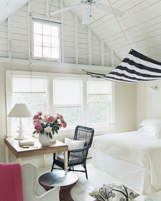
Since I've been spending my days packing boxes to make the move from Seattle to LA I've begun to appreciate the art of simple living. Less clutter lets you focus on the pieces that really make up a room, and this bedroom really emphasizes that. I love the idea of placing a canopy over the bed to create its own space, adding an element that breaks up the floor to ceiling white while complimenting the other black and white accents in the room. I also love the little pops of pink. It softens the look of the room and adds a feminine touch. Most of all, I just love how clean and open this space is! It really has a peaceful feel to it.

I actually ripped this page out of a magazine years ago and then found it on the Domino website recently, so I had to put it up here. Another example of a clean white look, i think it's just stunning how the gold jumps out, emphasizing the shapes of these classic chairs. Again, absent of a lot of clutter, the room lets you focus on the important pieces.

When I made the transition from Jr. High to High School, I distinctly remember thinking "Ok, time to grow up!" and requesting that we redo my bedroom. I painted my walls a lovely shade of light lilac and had a duvet with a pattern of Monet-esque flowers to match. Since then, I have never once wanted to decorate with a floral pattern or lilac walls until I saw this room from the Jeffers Design Group. With just a hint of lilac, the walls glow and cool down the room, and the headboard is amazing! The modern pattern with ornate traditional detailing really creates a lovely focal point. I also love how the lamps blend into the walls. Again, a very clean design.