Showing posts with label interiors to inspire. Show all posts

INTERIORS TO INSPIRE: DECADENCE WITH DUQUETTE

Today we are going to go on a new kind of tour. Not so much the traditional home tour I usually discuss, instead, today we are going to rummage through the archives of famed designer Tony Duquette. Don't fret my loves, before I'm done here I plan on leaving you armed with how to get his look, for your home.
Let's begin by having a peek at a few of his spaces...
(via)
You see, Tony was best known for "More is More". You won't find any sparsely decorated spaces with Tony's stamp on them. His are the kind out of story books; rich with mind boggling layers and details. Every room calls to nature in some way or another (or entirely) .

(via)
It was in the 30's is when his career took off. Tony started in costume and set design, then naturally it evolved into creating magical spaces for everyday people instead of just for the dreamlands of movies. But he really did it all; costumes, sets, (especially) jewelery, interiors, there was nothing his creative mind didn't fiddle with.
(via)
Tony was native to Los Angeles, he lived and practiced there for his entire life. He was married to Elizabeth Johnstone for 46 years before she died in 1995. He died 4 years later due to heart complications.
(via)

With such complex layers of design going on, let's start by breaking down the dominant characteristics of his work before we attempt our own version...

* Rich textures, including plenty of velvet.
* Opulent metal work, detailed scrolls and woven patterns.
* He's quite attracted to jade green and uses it in nearly each space.
* Leopard print, reptile skins, mounted beasts... these all live in his master plan.
* Asian influences.
* Finishing touches are down-to-the-last-detail, usually scrolling and delicate, tiny and indiscernible through a camera lens, but in person, the texture lives in the details.


While his spaces are certainly indulgent and probably and not realistic for everyday life, they are definitely something we can draw deeply from, infusing our homes with sparkle (like that incredible mica wall covering!) and saturated color palettes including cardamoms and mints. Love it.

xoxo,
-Julie

*learn more details about Tony here.

INTERIORS TO INSPIRE: SWEET DREAMS

Julie here from Chapman Interiors and today we'll be wandering through a land of bubbly blush and risque rose (just in time for Pantone's color of the year) . Spring is (almost) in the air, and just the notion calls for silky drapes in the softest ivory, flirting with cozy gilded frames and furniture.

A gracious and girly parlour filled with bright whites and speckled with gold and pink, is just sweet enough to brighten any one's day. The abstract art and minimalist feel keeps things from being a touch too sugary. 

Pools of soft linen and silk guarantee a Marie Antoinette atmosphere while more touches of gold abound.
I love the surprise pop of bubble-gum ottomans waiting cheerfully at the entry to greet guests (and of course, serve for a pretty little place to put your purse!)

How do we duplicate this glamorous look at home? Stick with a parchment base, add a dash of glittery gold, and sprinkle blush and honeysuckle throughout (sort of like your own cherry-on-top). And, because most of us can't get away with too much pink, we opt for some subtle blushes and nudes...
 
The crocodile ottomans bring in a soft tan while the kilim rug adds worldly flair and incorporates a touch more of that pink we're after. Group framed art together with assorted frames (at least a couple of them should be gilded and on the wider side) add a marble topped table and a traditional french chair and you, my dear, are well on your way to an afternoon of tea and crumpets, surely to be followed by lounging in the late afternoon sun... ahhh just right.

xoxo

(images via Suzanne Kasler)

INTERIORS TO INSPIRE: BOHO CHIC

Hello everyone! Julie here from Chapman Interiors, and I am absolutely swooning in delight over this space, today! It's rocking a mix of design with performing an amazing balancing act between casual and formal styles... 
In the living room, a casually slip-covered chair is just loungin' next to the very square settee (with ladylike posture).  The fancy trim and tall bookcase *might* be looking down at all the fun furniture, but the large piece of light, modern art is putting the stuffy moulding in its rightful place. Leave it to a round ottoman to say "let's all be friends" by pulling the pieces together.

And over here? Well, the sleek and curvaceous Panton chairs are having a heyday with the hard nosed dining table that doubles as a desk (note table lamp).
The mixing + mingling continues in the bedroom which offers a chic and simple place to catch up on sleep. Those oval windows are the bee-knees. (Side note, a big, bold coverlet allows you instantly transform your space... imagine this bedroom without the fun magenta addition. It would still be quite nice but a totally different vibe, yes?)
Let's go shopping and get this look for our very own:

So fun! I'm loving the casual-mod and formal combination. We got crafty by adding the salvaged architectural column topper as a side table to channel the formality of the crown moulding in the inspiration image. And the suzani on that sofa would make it SO much more inviting. 

What do you think? Could you mix styles or do you prefer a more streamlined approach?

Cheers!
-Julie


*images via nuevo estilo) resources: leather butterfly chair, coralie bickford smith books (you'll have these forever, go ahead and buy them now!), classic urn lamp, Oly's Issac sofa, hide rug, suzani pillow, wire side tables.

INTERIORS TO INSPIRE: GOLDEN GLORY

Hello friends, and happy new year! Julie here from Chapman Interiors bringing you an Interiors to Inspire home tour that is sure to tickle your fancy. This project by Nate Berkus in Chicago immediately caught my eye with the extensive use of caramel throughout. (Because lawd knows, I use this color in nearly all my projects.)
 
The chairs are the show stopper in this modern-meets-traditional dining room. But, the silhouette of the dining table, sparkly chandelier and moody art all make the space truly outstanding. Modern and traditional are well at work here.
 
The sitting room is comfortable with it's golden silk rug and sumptuous fur throw. Cool and warm tones are balanced perfectly, making the room neither masculine or feminine; it's timeless in every way.
 
In the cozy den, the walls are glowing with gold. A leggy coffee table, tufted arm chair and zebra rug keep the room dynamic (oh, and that adorable sequin pillow adds a punch of whimsy!). I imagine this room feels warm even on the most grey winter day - something to keep in mind for those of us in the chilly climates!

Here's what we come up with to translate Nate's look for our own space...
 
The trick to mixing modern and traditional is to keep the color palette strict. For this project, use plenty of golds and warm metals, keep the walls a light neutral (a cool-based gray would work wonderfully) and don't forget to add a few modern (very straight-lined) pieces. Before you know it you'll be the queen of mixing styles!

Ta-ta for now,

xoxo

INTERIORS TO INSPIRE: COZY MODERN

Honey, I'm home! Julie from Chapman Interiors here taking you through a home where modern sensibilities meet serious comfort (not an easy task!). The key? A whitewashed background is a blank canvas that showcases furniture and art..
There are a few amazing things going on in this space, but on the top of the list is the stained stripe flooring... a fabulous idea that makes the space dynamic but not over-the-top. Also loving the highly ornamental clock floating on a smooth white surface - two very opposite design styles work well when they're so extreme.
Large wall art and organically shaped cowhides bring personality and visual texture to the space. The bookshelf even has a few red books that echo the bright color from the art, the perfect way to draw the eye from one to the next! In the entryway, imperfect topiaries add a touch of whimsy.
Love the chocolate and white bedroom! The white walls let the striped rug and silhouettes of the furniture take center stage. Add a pop of greenery and lavender throw to make things friendly and warm (not to mention a four-legged friend!).

Get the Look...
* Stain floors a chocolate brown.
* Use unique pieces of furniture and graphic area rugs.
* Hang abstract art that is full of lively colors.
* Walls, ceiling, and trim should be painted (the same) white.

Amazing how a modern style can still feel so timeless, don't you think? I could totally see myself living with this look for a long time!

xoxo

INTERIORS TO INSPIRE: WARM BLUES

Julie here from Chapman Interiors bringing you a home today that's filled with burnished golds and blues ranging from cobalt to cornflower - a beautiful combination that's strong and elegant at the same time. You'll see that by keeping furniture simple and restrained, designer Frank Roop maintains the air of sophistication within the limited color palette, but doesn't forgo color entirely.
We find the color bursts confident in their saturation (pillows, lampshades, flowers), but simple in the way he uses them in blocks vs. pattern. Do you notice how each piece catches your eye, and yet they're all incredibly well balanced.
The furniture and bones of this space are neutral, but not boring. Choosing a range of grays, tans and subtle pastels for the main pieces keeps them soft without being matchy, which adds extra interest and feels less predictable.
Look at those flowers! Tightly arranged in their vase offering a vigorous shot of color, just like the rest of the home accents. And notice the absence of pattern... a great recipe if you're looking for a space that is clean but still approachable. (And easy to swap out when you're ready for a change!)

Get the look for your own space by employing structured neutral furniture and solid pattern as your two biggest tools. Add a little shimmer with metallic accents, and try to limit your color palette to two main colors, (but within those colors you are free to vary them a bit). Don't forget the monochromatic floral arrangements - this little detail will complete your room! Have a look at what we come up with ...


Voila! Simple and clean with a little fun color. What's not to like!?

xoxo

-Julie

*resources: sofa, brass lamp (love this guy!), fuschia mums in glass container, chrome table, sunshine throw, silk pillow, bolster. room images courtesy Frank Roop)

INTERIORS TO INSPIRE: ROMAN WAREHOUSE

Hello friends, Julie here from over at Chapman Interiors. Are you feeling Italian today? Good, because we are traveling to Rome where two sisters have reclaimed a once industrial warehouse and transformed it into a home and studio. The sisters (Diane and Evelyne de Clercq) happen to be designers, which will become beautifully apparent while on our tour..
I'm seriously considering taking up sewing if it means I can store spools of vibrant yarn in my studio. I can't get over how beautiful  and simple it is. Don't worry, I haven't overlooked the to-die-for antique doors. The sisters scoured Italian flea markets for months collecting doors for the whole home (please excuse me while i whimper with jealousy).
The open kitchen is perfectly European with simple cabinets and limited uppers. The hand-painted tile adds a very personal element, and the sleep appliances and industrial touches balance the old world charm.
I'm dying a million ways for this office space! The illustrated closet drawing on the (wonderfully tall) wall, the desk floating mid-room, the colorful pencil holders, the kelly green task lamp, and a petite Asian screen. It's all so simple and absolutely stunning. (But where, pray tell, do they sit?)
The exterior of the home seems to be wrapped in vintage glass - hello natural light. The doors coordinate with the buffet and the green bowl is the perfect pop of color.
Ready for patio time and a bellini after a long day of combing the Italian flea markets? Me too.

While not too many of us are enjoying a restored warehouse in Rome, we can use this space to inspire ours with:
* Simple pieces in wood and metal.
* Accessories should be bright, graphic shapes. (This is especially key to this project.)
* Various hand-painted works.
* Case goods with glass doors.
* Maybe there's even room for a good illustration on your walls?
Hope your Tuesday is as fab as this home! Ciao bellas!

xoxo,

(Images courtesy Marie Claire Maison)

INTERIORS TO INSPIRE: GLAMOROUS MIDCENTURY

Hello everyone! Julie here, from Chapman Interiors. Get ready to be wooed and wowed by this lakeshore  drive home designed by Angie Hranowsky (this woman has some serious talent folks, she also runs a  graphics division for her company). The home is filled with a mix of eras where the cool lines of the modern pieces are offset by a soft palette and a few curvy feminine additions for good measure. The mood is soft and inviting. Let's have a look! 

If Angie confessed that she'd based their entire design on the Donghia Suzani color palette and print, I'd believe her (and I wouldn't blame her - it's a fabulous fabric!). Great design tip: the graphic mid-century modern screen near the front door is complimented by the vintage David Hicks pattern on the danish chair on the left.
A personal collection of art is a fabulous way to share your own personality and taste; it also introduces variation in style and color. (And notice her pieces displayed are within her aubergine/fuchsia/nude color palette? I bet that wasn't an accident!)
 
Simple dining room pieces are livened up with a zebra rug, cute blue ottomans and a perfectly feminine occasional chair. (I do wish the chandelier was larger, or more of a statement piece. She could have done a drippy crystal chandelier and it would have been lovely.)

Well hello again, beautiful suzani! We've seen you before, except now you're center stage. I'm drooling over the chrome canopy bed. It's a completely modern element in the room that would be lacking otherwise.

What an adorable little mid century home (boasting southern California genes). The exterior and interior flow together perfectly, it's always important to reference the architecture when you're designing your interior! (It would have been charming if the front door was the same deep magenta from the Donghia material!)

The most important bits of style here:
* Select pieces that are vintage, often with a straighter line.
* Wood is smooth and finished.
* Use a bold print to guide your color palette choices throughout the rest of the house.
* Create a collected feeling throughout (think gallery wall & vintage modern pieces.)
* Add a dash of chrome.
* A solid dose of graphic pattern will bring things to life (stick with the color palette from your one bold print).

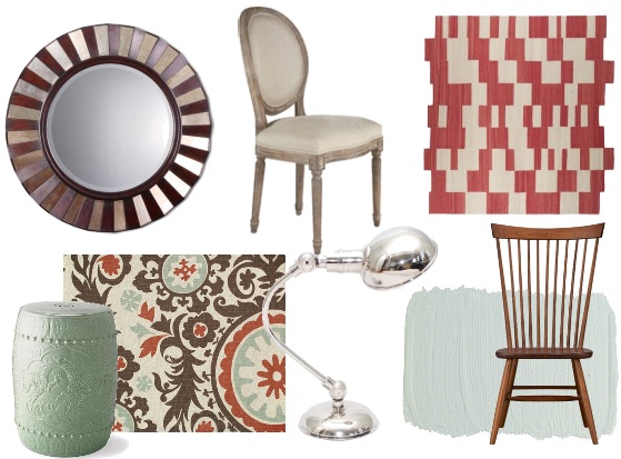
And here's what we get, (for my collection I used the suzani print in the lower corner as my inspiration to guide the other color decisions).

A little celadon, a little wood, a little chrome = a lotta style! I am loving the soft aqua and rusty red (good for moving into fall too...).

xoxo

INTERIORS TO INSPIRE: GENTLE CONTRASTS

Hello darlings! Julie here from Chapman Interiors bringing you the softest, most ethereal home tour yet. Beauty abounds as warm light floods into this Brooklyn Townhouse designed by Tom Scheerer. The mood is quiet and calm. Reserved and collected. A tailored eye creates small vignettes of carefully collected art and furnishings throughout the home while the buttery paint reflects the warm light and is a perfect backdrop for darker wood accents.

I'm kind of dying over the mirrored sconces flanking the incredible carved fireplace. (Perhaps we could recreate that look with a traditional sconce and have a mirror custom made to fit?... ohhh yes.. I think so...) The sofa's lines are like a ribbon wrapping around its lucky guest. I love the surprise of the straight mirror to the ceiling; it carries your eye up to the detailed crown and adds a dash of modernity.

A pair of benches set a casual vibe in this classical room, and the dining table's reflective surface lets light dance around freely. There are an abundance of textures here; high gloss table, leather benches, carved marble, sea grass window treatments... it's all here, and it's all amazing!

Loving the delicate dots on the drapes paired with the silhouette of the side chair and traditional table. The circle pattern from the drapes seems to be echoed in the lantern living underneath the table. (fabric on right is Schumacher's Ripple Effect.)

Ahhh, the bedroom. The steely blue drapes reveal a feminine space; the light is captured here again by avoiding the use of a bed skirt and letting the sunshine seep under the bed and peek out the other side. A tall four-poster bed and drapes leading to the ceiling enhance the architecture's height and drama.

This may very well be my favorite room in the house. The woven bench and vibrant rug play so well with the modern headboard and white linens (plus that cobalt blue has certainly been catching my eye lately). Fresh flowers always add a little home comfort to a room, too! (fabric on left is Schmacher's Emilie Cachemire.)

Let's review the basic elements here:

* A soft creamy palette and rooms filled with architectural details.
* Casegoods in darker wood for contrast.
* Upholstered pieces in natural woven materials and often solid (think burlap, linen, cotton).
* A few modern pieces and textiles keep the space feeling current.
* Steeped with natural textures and friendly potted plants.
* Vignettes of collections throughout.

An inspired selection would look like this...


This approach is perfect for the person who wants to display their collections without feeling cluttered. Texture and contrast keep the space dynamic. Furniture is comfortable and pieces span various decades of style, yet it all works together because of the soft color palette and natural materials. This is one of my favorite and most inspiring homes yet!

xoxo
-Julie

*resources beginning at top left: low basket, glass lamp, gilt frames by Pottery Barn, wishbone occasional chair, dresser by Anthropologie, Oasis sofa from Crate&Barrel, woven basket with lid. Terracotta pots are filled with thyme and sage.

INTERIORS TO INSPIRE: GLAMOUR IN PASTELS

Hello Lovelies! Julie from Chapman Interiors here bringing you a true Hollywood Glam home today. Designer Jay Jeffers is responsible for the fresh color palette brimming with coral and aqua and unique details that create some real personality in these rooms. Let's check it out!
I am dying over the windows softly traced in that aqua (presumably to call more attention to the fabulous architecture) . The mushroom colored settee is a departure from the expected sofa, giving the light permission to flood right in where a sofa back would usually be cutting it off. Fluffy white pillows reinforce the glow.
There is sparkle everywhere! The tiny mosaic tiles (in the same appropriate aqua!), bubbly mantle piece, benches floating on lucite legs, chrome coffee table base, silver candle sticks in the fireplace... all together these accents shout glitz and glamour (and yet the room seems to seductively whisper, don't you think?).
This chandelier makes me giddy! The delicate vertical elements pair perfectly opposite the glowing glass bubbles reaching for the table. The coral ceiling and wall trim are a great way to introduce color without being forced to paint an entire wall. I think those tulips may have been custom dyed... they're too perfect!
The dining table being set at an unexpected angle and the fun zebra sideboard make the space dynamic and exciting (Bonus: It's fairly easy to change the material on the sideboard on a whim! This is an easy and impactful way to bring in some bold graphics without spending a fortune).

In using this style to inspire your space,

* Consider painting your trim an aqua color and letting the walls take a back seat in ivory.

* Choose an art deco inspired occasional chair in a patterned upholstery. Leave the wood very dark or have it refinished with a dark lacquer.

* Add a few patterned upholstered pieces that don't match each other perfectly. Even better if the material has a little splash of metallic.

* Furniture should rest on a thin leg (or even a lucite leg!) to impart a light and airy feeling.

* Accent with a soft coral, grays, aquas and tans.

* Don't forget a dash of sparkle and glam, after all, this is a Hollywood home!

You'll get a little something like this...


And there we have it!  Hollywood is knocking...

xoxo

-Julie

*resources: chandelier, gold pillow, coral pillow, Benjamin Moore Heavenly Blue #709, white settee, glass coffee table, deco tray, 1st dibs vintage chair.

INTERIORS TO INSPIRE: LUXURIOUS CITY LIVING

Happy Tuesday! Julie here from over at Chapman Interiors. I hope you are ready to ohhh and ahhhh at some luscious downtown living, designed by S.R. Gambrel. The space is polished perfection - just what I'd imagine NYC life should be like. (Note throughout the entire home a circle & squares theme seems to sneak in to nearly every room!) 

Welcome to your vivid polished marble entry foyer where the walls and ceiling are done in a high-gloss finish to reinforce the über polished appeal... I can just hear the high heels clicking across the floor!

Boasting cheerful orange and industrial pewter, this console is perfect place to mix your after-work Manhattan.

The closet has me swooning! That ikat print is just the right graphic touch making the space memorable and fashionable. You could easily duplicate this idea by adding wallpaper to the center of your closet doors - voila, updated closet that shouts high-style. If your doors are flat and don't have a "center," add a touch of moulding to create your own frame. (Just be sure if you have sliding doors that they have room to pass by each other!)

This may be my favorite room of all. The detailed moulding on the ceilings and the heavy-but-light-but-industrial pendants are incredible. ( I always love paired pendants instead of a single chandelier if the spacing is right for it). The floor to ceiling built-ins are to die for, the circle detail and metal finish make them especially noteworthy.

Soft silk drapes and textured mossy accents add just the right amount of softness to the gentle gray palette that can get too cool quickly. Time to kick your feet up after a long day on Wall Street.

Get the look!


*resources: pendant light from circa, donald kaufman color in DKC-62, metal side table, orange abstract art, moss orbs, mirror and wood buffet, modern sofa, medallion wallpaper.

Styling Tips:

* Instead of a bright buffet, you could swap it for a bold, simple piece of art (make sure it's large!) just as long as you get a jolt of color.

* Large furniture pieces should be parchment or ivory colored and very clean-lined.

* Choose wood finishes in espresso or black.

* Paint walls high-gloss where you want extra sheen.

* To keep the theme consistent throughout the house, choose patterns with a circle or square motif.

* Carry your eye up by mounting drapes all the way to the ceiling.

Now make yourself a martini and have a fabulous week!

xoxo
-Julie

Images via SR Gambrel.