Showing posts with label home tour. Show all posts

ROOM OF THE WEEK 12.2

Lately, it's been harder and harder for me to find a space worthy of Room of the Week status - it seems to me that they've been underwhemling, overstyled, or blogged to death. But this room had me at hello!
bcn_contemporain_43_071209_1260185887_0_
Yesterday I was featured over at La Dolce Vita where Paloma was sweet enough to ask me to participate in her "10 Things I Can't Live Without" series. As I was browsing through, the post directly under mine happened to be about her dream home... this was the dining room she chose.
estudio-lazaro4
I'm sorry, Paloma darling, but I'm kicking you out of your home and moving in! I love everything about this room - especially that open atrium feel given to the space by the mirrored cabinetry and those stunning entryway doors. A statement chandelier is absolutely necessary in a space like this (anything else would just disappear) and I love the addition of the floral on black rug - dramatic and traditional at the same it, it completes that garden dining feel. The mix of chairs is also just perfect, playing of the black and white contrasts in the room.

And, just in case you're not drooling enough already... well, here's the rest of the studio:
bcn_contemporain_09_071209_1260185563_16_
bcn_contemporain_01_071209_1260185533_92_
Those floors!!!!!
bcn_contemporain_40_071209_1260183861_28_
All the work of Barcelona designer Lázaro Rosa-Violán whose firm, Contemporain Studio, does some amazing commerical projects. For more inspiration, I highly suggest browsing their site!

INTERIORS TO INSPIRE: ROMAN WAREHOUSE

Hello friends, Julie here from over at Chapman Interiors. Are you feeling Italian today? Good, because we are traveling to Rome where two sisters have reclaimed a once industrial warehouse and transformed it into a home and studio. The sisters (Diane and Evelyne de Clercq) happen to be designers, which will become beautifully apparent while on our tour..
I'm seriously considering taking up sewing if it means I can store spools of vibrant yarn in my studio. I can't get over how beautiful  and simple it is. Don't worry, I haven't overlooked the to-die-for antique doors. The sisters scoured Italian flea markets for months collecting doors for the whole home (please excuse me while i whimper with jealousy).
The open kitchen is perfectly European with simple cabinets and limited uppers. The hand-painted tile adds a very personal element, and the sleep appliances and industrial touches balance the old world charm.
I'm dying a million ways for this office space! The illustrated closet drawing on the (wonderfully tall) wall, the desk floating mid-room, the colorful pencil holders, the kelly green task lamp, and a petite Asian screen. It's all so simple and absolutely stunning. (But where, pray tell, do they sit?)
The exterior of the home seems to be wrapped in vintage glass - hello natural light. The doors coordinate with the buffet and the green bowl is the perfect pop of color.
Ready for patio time and a bellini after a long day of combing the Italian flea markets? Me too.

While not too many of us are enjoying a restored warehouse in Rome, we can use this space to inspire ours with:
* Simple pieces in wood and metal.
* Accessories should be bright, graphic shapes. (This is especially key to this project.)
* Various hand-painted works.
* Case goods with glass doors.
* Maybe there's even room for a good illustration on your walls?
Hope your Tuesday is as fab as this home! Ciao bellas!

xoxo,

(Images courtesy Marie Claire Maison)

HOUSE TOUR: ARTFULLY ENCHANTED

If there's one thing I enjoy seeing in other people's homes it's their choice in artwork. Art is so personal and unique that it's the one thing that doesn't always have to relate perfectly to the room. So, when I stumbled up on the home of designer Eric Cohler (as featured on New York Social Diary a few weeks ago) I nearly died...
ericcohler3
Can you imagine walking into all these walls - and windows(!) - of so many beautifully selected pieces on top of this gorgeous interior?
ericcohler2

P1050545

P1050569
... And that's just the living room! (Notice the cute little library corner too?). As if that wasn't enough there's also this cozy escape...
P1050331
The richness here makes it such a lovely contrast to the rest of the home, but it still has that same collective feel. If it were all my own, I'm not sure I'd ever need to leave!

SERIES SUBMISSION: HOME TOUR + GET THE LOOK

This week will be the last of the series submissions for contributors to coco+kelley! I'm so excited to be nearing the time for me to select the finalists, but as always I can't do it without your help! Remember to leave (constructive) feedback in the comments to help make this decision a little easier. Now - on to today's post!

I'm especially excited about this one as the contributor is an old high school friend of mine whose passion for design led her to a similar path, and she recently opened her own design firm (with partner Jamie) in Portland called Chapman Interiors. She also has a stunning little blog and I happen to love her personal style. Her series would be all about the home tours (who can get enough of those?) which would include a 'get the look' section at the end showing you exactly how to mimic the style of the featured home. I'm loving it already!
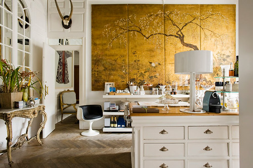
Traversing though fashion designer Jill Stuart's NYC pad leaves you feeling like you've wandered through an airy art gallery. Her modern style and plush living are (at the very least) enviable. Powered by a white palette and modern punches of color, the spaces are bright and intriguing.
Love the silhouette of flowers in a vase. Symmetry and monochromatic furniture makes the space polished but welcoming at the same time. Fresh arrangements soften the sleek feeling.

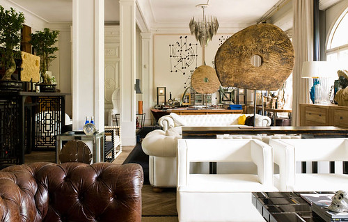
The gently worn leather day bed says "come sit down and kick off your shoes"; it's a great addition to the other, more modern pieces. The color is a perfect choice too - black would have been too masculine and heavy, white too monochromatic. The caramel is warm and welcoming and unique all at the same time.

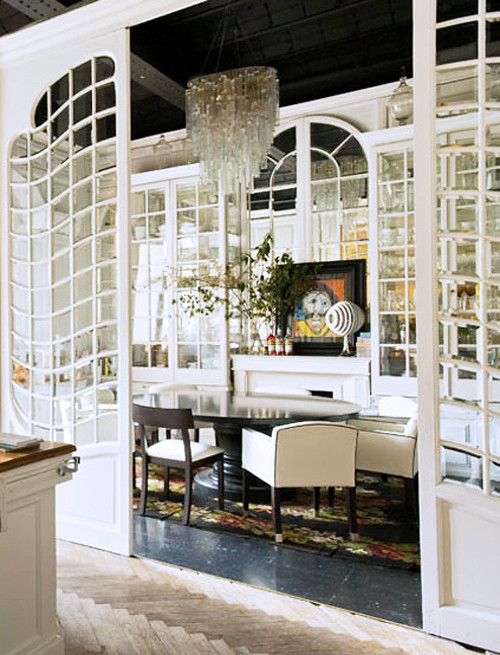
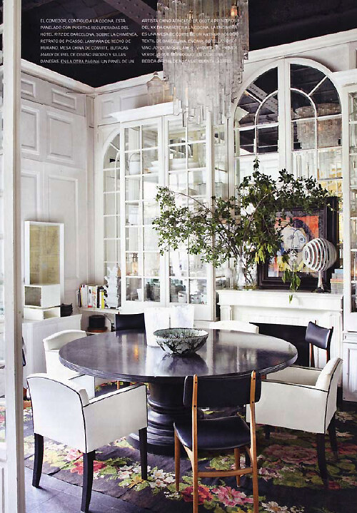
This is a great example of mixing modern (table+art), mid century (chairs) and antiques (chandeliers). The multiple small flower arrangements on the table a just what the space needed, it'd be too stark without them.

The large cobalt flowers serve double duty by bringing a little nature inside but also reinforce the color palette, this is an age-old designer trick. (Bonus, it's easy to implement and delivers impact.)
Such a beautifully serene bedroom. I love the large piece of white art, it leaves your mind's canvas clean and ready for a new day too. The introduction of soft blush (bedside flowers) is the perfect feminine touch.
The guest room is such a great space to turn the design factor up a notch. Considering you're not living in it every day, the bold color statement is fun for both you and your guests, like a little retreat at a swanky hotel.

*image credits: Elle Decor

Get the look at home:


*resource list: 1. crate and barrel brass lamp 2. white leather sofa 3. large mirror 4. black and white art 5. pink pillow 6. chrome tables 7. stack of vintage books 8. camel color leather ottoman.

Styling tips:

*Start with an all white canvas; walls, floors and ceilings (large furniture choices should be white or very very pale as well).

*Choose accent pieces that are a solid color (for example, an all fuchsia throw or a bundle of fresh flowers that are all the same color and tightly packed, pluck the leaves to strengthen their impact).

*Pick pieces with square edges and clean lines, no curves allowed in the furniture.

*Art should be abstract, either one large color block or abstract on a white background.

*Incorporate an oversize mirror with square edges.

Have fun with your new soft modern look!

Cheers,
-Julie
I love the space you chose to feature, Julie!! What did you all think? I'm especially fond of the resources at the end - these were totally spot on.

RENEWED

You know what gets me excited? Finding out that one of my favorite designers or decorators has moved into a new place.  You just know it's going to be a source for fabulous inspiration! But what I really love the most is seeing how old pieces look in new spaces. Moving around lighting, furniture and accessories to a different part of the home - let alone a whole different home - always revitalizes them! Which is why I couldn't resist making an example of the latest home of Lee Kleihnelter, which I'm sure many of you have seen before...
Lee's past designs have been a bit more vibrant and playful compared to her new digs which are just as gorgeous, but much softer and sophisticated. I think the same can be said for a lot of us as we move from space to space, honing our tastes but also choosing a style that's just a little more 'grown up'. 

The driftwood centerpiece of a coffee table looks strikingly different in these contrasted spaces! The first room casts a more retro vibe, but the table in the new room looks much more light, natural and acts true focal point. I vote for the new room in this matchup!
While the coffee table stayed in the same room, for this photo shoot, her classic Hermes throw moved from living to bedroom where again it makes more of a statement as an accent piece. You can also see how Lee loves her large headboards as well as neutrals in the bedroom! She reused her same chairs, and I believe those could also be the same lamp bases with new shades... and a pup in both photos!
From her former bedroom, Lee opted to put this gorgeous chandelier into her new dining area, which is dark and dramatic compared to her more organic previous design. And... check out those mirrors. Look familiar? Yup, they're the some ones used as her headboard in the same bedroom above! See, isn't this game fun? I have to wonder if the chairs are the same ones, too...

More than anything, I think it's refreshing and realistic to see how designers use their favorites in new spaces. While our styles can certainly evolve, there are pieces that will always remain the constants in our homes.

*images via pieces press page

WHITE SPACE

Yesterday I indulged in a copy of the latest Nuevo Estilo... mostly due to this amazing home and its fabulous use of white space, simple decoration and touches of green...
The simplicity of this sweet vignette is killing me! One blanket for you, one blanket for me... and those pale spring green and aqua striped pillows! You had me at hello with your adorable tassels.
The pops of rich red here and there are fantastic. I also adore how all the pillows throughout the house have that slumpy, lumpy worn in look... perfect for this style. But the real genius here is the empty white walls. There's just enough color and thoughtfully placed artwork so the rooms don't feel bare - just fresh fresh fresh!
This might be my favorite... that green!!! Wouldn't it be lovely with a floating fabric canopy over the bed though?? On top of all this...
A fabulous outdoor entertaining area, complete with chandelier (and more stripes!). I don't know about you, but I am completely ready to move in.

*for the full house tour and article, visit here.

ROOM OF THE WEEK: THE EARLY EDITION

Since we won't be having one later this week (yes, I am actually taking a day off from blogging - amazing!), I wanted to share this Room of the Week - done by Kishani Perera - with you now. I've literally been swooning over it for weeks! (Ok, the whole house is gorgeous, so let's just go for it!)
Maybe I love this space because everything about it is so very "LA". The home itself, I could instantly recognize as very similar to most bungalows in the area. But, I suppose what I really love about it is that it departs from the total mid-century modern or spanish influenced decor that you would normally see in these homes, and instead injects that very recognizable Hollywood glamour as well as those little pops of color.
Seriously loving the dining room. The chairs, the art, the paint... everything. It was this bedroom that really put me over the top. I would never have thought to paint my bedroom rich green - and it's my favorite color! I mean, really!?! With those dark accessories, it just works. Very lush and a little exotic.
So... when can I move in? No really...

Home Tour: The Chin's Loft, San Francisco

Instead of bringing you a Room of the Week today, I thought a whole house was in order - specifically this amazing, creative, and refreshing loft space that happens to be the home of photographer Kevin Chin and his equally talented wife (and floral designer!) Nancy Liu Chin. Oh, and their little dog too...
Many creatives work out of their home these days, but the Chins have taken this idea to the extreme with Kevin's studio placed right in between their living room and dining area - not an easy challenge!

"I choose this loft because of the great light and 18 foot ceilings. You can see from the photos that I have no problems mixing living living space and working space together. In fact, our friends and my clients tell me that they like walking into our loft and immediately they know they are in a photographer's loft. The open floor-plan makes it great for entertaining and the concrete floors ideal for doing photo shoots in the loft.
"
The trick to making it work seems to be Kevin's ability to use the space like a studio and gallery without cluttering things up. Like storing photos in silk boxes and finding simple and attractive ways to display his work.

"I specialize in real "film" so having lots of wall space in our loft gives my clients the opportunity to view fine-art prints matted and framed and hung on a wall to be appreciated as art as opposed to looking at digital images on a computer screen," explains Kevin.
"I kept the colors neutral so as to emphasize the artwork on the walls. I did paint a few accent walls with Ralph Lauren gray suede paint which has a beautiful texture. I choose a few key walls that gave the loft more depth and dimension, like the long stairway leading up to the mezzanine level.

The only dramatic color is a large, over-size color wedding photo of us in our dining wall. It is a photo of us in front of a large mural on the alley in which we live. I love the contrast of the vibrant colors of the mural.
Even the bedroom is done in mostly white with accents of silver..."
I love that Kevin and Nancy chose to keep the bedroom all white too - very relaxing and bright! And how cute is that lineup of their baby photos along the dresser? I get the feeling that Chin Chin likes the camera too... such a model dog!
The Chins have a great attention to detail - even in their more functional spaces, like the office. From the collection of vintage cameras and baseballs to the sleek magazine holders - everything has a place.

And what does Nancy think of it all?
I'm proud to say that I'm married to an incredible person. KC furnished many of the pieces without telling me. Most women would just die not having a say in the decision but I trust KC's taste in design, fashion, and art! And, one of the things I love most about our space is that even in winter it's warm. Many people have this notion that lofts are cold, industrial spaces and we are so fortunate that we have lots of light. Lighting is so important in good design.

After seeing this space, I think I'd trust KC too! And the lighting definitely can make all the difference - when the sun is shining in, even in the winter, this space looks very inviting, personal and warm. My question is... when you have parties, do you get to use the studio as a 'photo booth', because I would!!