Showing posts with label orange. Show all posts

CHIC LITTLE ENTRYWAYS

Currently obsessing over fresh + fantastic entryways like these...
mixr entry way entryway concret floor moroccan tile grey black cabinets
With tile like this you can hardly call it a 'mud room', but with plenty of storage for coats and shoes, this entry is the chicest definition of the term I've ever seen (plus, you know I'm loving the black + white stripes at the doorway!).
entryway+orange door+ black wall coco+kelley
Love the depth a little black paint gives to this simple entryway, and the vintage accents give it great character. A vibrant orange door is so cheery and welcoming! I love how the collection of artwork in gold frames echoes the color against fresh white walls.

As a side note... I'm totally returning to black and white palettes these days. I realized that sometimes I'm too afraid to add a little black to a room, thinking that somehow it doesn't work with softer styles, but it really just adds a wonderful touch of drama! 


*images via cococozy, unknown and pure style home via creategirl

MY SPRING PALETTE: APRICOT + BLUE

It's official - I'm making this my spring color palette inspiration:
spring fashion color palette blue apricot coco+kelley
I've already purchased a pair of apricot shorts and a very peachy little belt from Anthropologie, and I adore the way it looks with a pop of blue (any shade will do!). Which is funny because this was what my inspiration board looked like for last spring...
2010 - 225
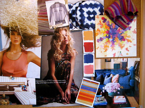
Basically the same line of thought, but a little richer, with indigos and clay reds. I guess I should really start following my own advice a little sooner when making wardrobe purchases! I like freshening it up with black and white accents though - much more current!


*image ali stephens for elle france (source unknown) and inspiration board by coco+kelley

PINK + ORANGE: A NEW TWIST

There's nothing new about the duo of pink + orange. It's been a popular choice for cheery interiors and perky weddings for years now, but it still absolutely puts a smile on my face...
cocokelley pink+orange
Recently, however, I've been seeing these colors in a new light. Combining this fresh and modern pair with dark old world influences and gold gives it a richness that that takes it from girlish and playful to exotic and luxurious. Personally, I'll take it either way!

*chairs via shopAD, jewelery at erie basin, interior unknown, jack & lulu stationery

Tastey Tuesday {Orange You Delicious}

As we enter into August (really, August?!), it's time to start relishing every soothing and satisfying summer moment before they all slip away. That's why I just loved these brilliantly simple "orange bowls."

4831101736_0714901ecb_bdomino_junejuly07_scannedbydressdesigndecor
4831104618_2de313f343_b
photo via fee amore and domino kitchen spotted on dress design decor

The orange scooped clean and filled with sweet vanilla ice cream becomes your very own homemade creamsicle! Can't you just see a candle-lit picnic table peppered with little citrus balls? If you ask me, a table for one, particularly in that kitchen, would do just as nicely!

Here's a yummy milk sorbet that I'm going to have to try for my next summer party. Bon appetit my dears.

Vanilla Bean and Milk Sorbet via Cannelle et Vanille

500 grams organic whole milk
125 grams sugar
3 vanilla beans, scraped
150 grams heavy cream, soft peaks


In a medium saucepan, bring the milk, sugar and vanilla beans to a boil. Remove the pan from the heat and let the vanilla beans infuse in the milk for about 30 minutes. Strain the milk and reserve the vanilla beans for another time. Refrigerate the milk for at least 4 hours.

Churn the sorbet in the ice cream machine. In the meantime, whip the cream to soft peaks. When the milk base is almost done churning and forms ripples, add the whipped cream to the machine. Let the machine mix it all together but don't mix it too much otherwise your cream might turn to butter.

Seasonal Colorboard

I noticed today that the leaves have started to turn shades of golden yellow, burnt orange and soft siena. I bid a fond farewell to summer and am excited to embrace the beautiful oranges of fall. 

They appear to be all I can see right now. Enjoy!


lanterns via martha stewart
fall ensemble via delight by design
the love kate beckinsale vie haute design

Room of the Week 9.3

As we slowly, reluctantly move into fall, I find myself wanting to pull in richer colors (my rooms have been very neutral with accents of pale blues and touches of gold all summer). So, I've been collecting color schemes in my head, and this cozy dining room seems to be just about perfect...

You may remember that I started a little Domino Magazine pool right after our *sob* favorite glossy folded, and that is where I rediscovered this beautifully understated room. Sometimes I kick myself for purchasing so many furniture pieces in neutrals, but this room (once again!) proves how smart this strategy is - especially for designers on a budget! By changing the accessories, the mood can be totally transformed. Take away those saturated blue drapes, the bowls on the mantel, orange artwork and accents on the table, and you've got a completely clean slate to work with!

Since moving in with the boy, I have been trying to incorporate more blue (his favorite color as far as I can tell), and I myself have been drawn to corals, pinks and oranges. While this space is a bit more traditional than I'd normally be attracted to, the clean furniture lines help it feel somewhat modern, and I'm dying for that chandelier! Interesting that they chose to use something mounted vs. hanging, no? Above all, I love that the room still feels very fresh and simple - something I always aim for in my designs.

Orangeriffic

I've yet to tire of the "it" color for spring. 


scarf via lorick, shoes via jak & jil, room by David Jimenez via largom

Not that I'm advocating for orange head to toe, but the perfect little pop goes a long way, don't you agree?

Oh My, Orange!

I have to admit, I was somewhat surprised that my color predictions week here at coco+kelley didn't include any orange! It seems to be a hot color for the spring, and one that I have definitely been drawn to lately...

orange pop

Orange seems a bit retro, so seems quite fitting with the vintage stylings of this Issac Mizrahi dress, and I love how fresh the dahlias look set upon this casual table. There's something to be said for crisp white linen paired with this color!

One of my favorite rooms from the Los Angeles based design group m. design features this glamorous pair of mirrors with a perfect splash of orange to add character. How fabulous do they look between those topiaries in the gold pots?

orange pop2

A strong citrus orange was also featured in some of my favorite Spring collections - proof that if it's done well, it's actually a very wearable color! Sweet summery dress from Jenni Kayne, statement orange trench from Etro, blended with beautiful blues and pinks in the Akris collection, and a pop of neon in a flowing gown from Halston. (All photos via style.com)

Makes me think of one of my all-time favorite rooms from Tom Scheerer...

tom scheerer

I love the way the orange pops against the neutrals in the room, gives it so much life, don't you think!?

Room of the Week 1.15

Lately, I've been much more drawn to underdone spaces with simple colors and details like this airy bedroom...

corburn architecture

I am loving the pop of the curtains agains the bright white. Orange and blue are such a wonderful combination - it always feels a bit nautical to me, but I think it's a nice 'compromise' palette that can be both masculine and feminine as well. Adding a touch of floral pattern to the space helps warm it up, as does a creamier tone in addition to the white.

What do you think? Is it boring, or inviting? Too practical, or practically perfect?

Weekend Shopping

Drawn to orange and blue this weekend while shopping...


You'll never guess who's making these beautiful vintage inspired pillows...


Love the pleated detail on the sides! I'm head over heels for the warm peachy tone.

I also couldn't put these down when I saw them at Anthropologie . I know they've been out for a while, but I was sooooo wanting the orange ones. Gilded stoneware anyone?


Room of the Week 6.19


I'm sure many of you have seen this room by Healing Barsanti (via Zia Priven's website) before... but I am SO feelin' it right now that I had to use it as my room of the week. It's fresh, it's chic, it's perfectly capturing that mixed use of patterns that we're seeing in homes and on the runways these days. I'm especially in love with how they used the curtains to frame the doorway. The fresh green plants add a needed pop of an additional color, and the glowing chandelier reflects of the ceiling nicely. Perfectly designed for the Hamptons, don't you think?

And just because I couldn't resist... and it's Resort Week...


How about a little Nicole Miller to match? Hee hee!