Showing posts with label blue. Show all posts

MY SPRING PALETTE: APRICOT + BLUE

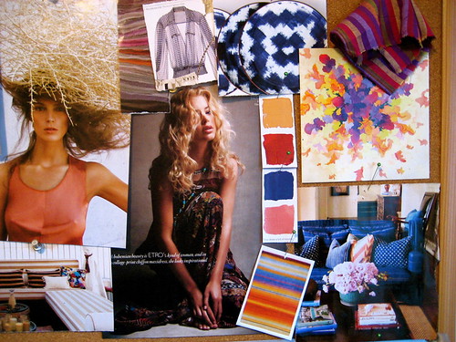
It's official - I'm making this my spring color palette inspiration:
spring fashion color palette blue apricot coco+kelley
I've already purchased a pair of apricot shorts and a very peachy little belt from Anthropologie, and I adore the way it looks with a pop of blue (any shade will do!). Which is funny because this was what my inspiration board looked like for last spring...
2010 - 225
Basically the same line of thought, but a little richer, with indigos and clay reds. I guess I should really start following my own advice a little sooner when making wardrobe purchases! I like freshening it up with black and white accents though - much more current!


*image ali stephens for elle france (source unknown) and inspiration board by coco+kelley

SEASCAPING

Missing my beach time and dreaming of the sea...  I think these two pieces would be lovely additions to the home as little abstract reminders of that feeling of calm I get when looking out at the ocean...
angelaadams_OceanSeaglass_S
*angela adams rug in gorgeous pile texture
sf paper topography
*stunning and intricately layered paper artwork recreating the san francisco bay by crafterall on etsy

WINTER BLUES

Every January I hit this post-holiday realization that winter is not even close to over...
floral-skirt.fabiobarelet
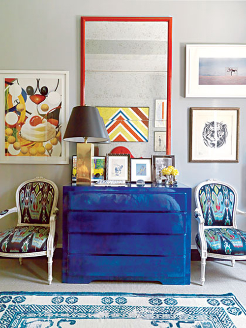
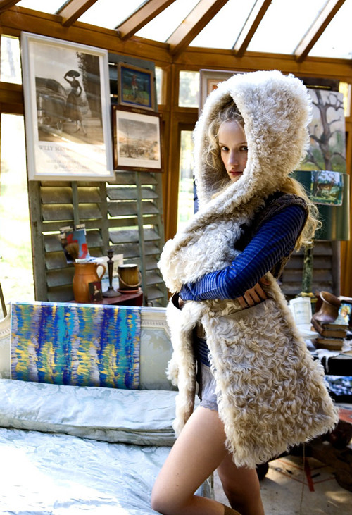
... it's around this same time that I gravitate to bold hits of blue against warm creams and fresh whites...
milesredd.nymag
Perhaps it's a craving for blue skies or tropical destinations?
2c_davidshields_364L
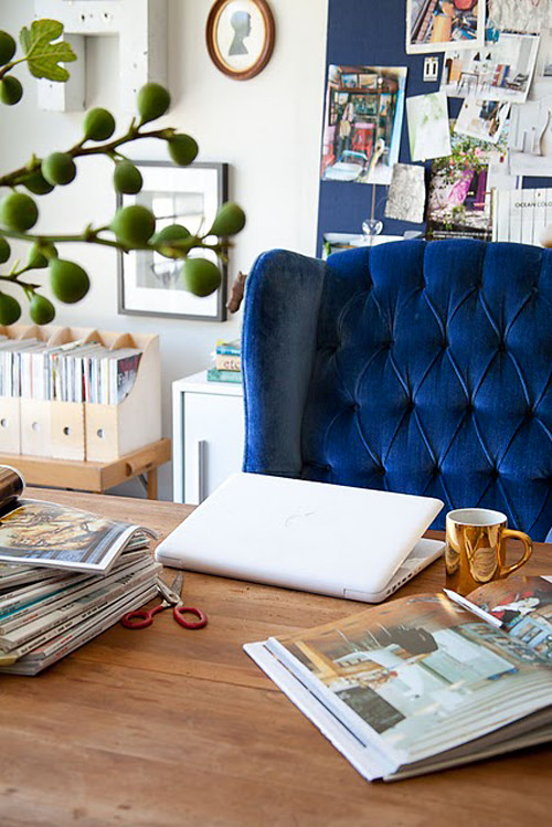
Maybe it's a pull towards something strong as we try and push our way into Spring...
via moth design
Or - most likely - it's the fact that this bold royal blue brings a surprising sense of calm at the end of a hectic season and a breath of fresh air with the revitalization of a new year at all once. Either way, I think I'll try adding some doses of it into my life, pronto.

*images via fabio bartelt, miles redd via nymag, david shields, and emily henderson

SUMMERTIME BLUES

Believe it or not, this weekend was spent inside the house watching the rain fall. In August.

It certainly is enough to make a girl just want to stay in bed...
Picture 2
Especially if the room is boasting these soft summery blues...
3783782412_aec971f865_o
Of course, if this were my dressing room, I might be just a tad more motivated to rise and shine...
milesredd3 via lovelist
Wouldn't you?

*sigh*... Off to another busy week..!

*images via flickr and interior by miles redd via the love list

GLOBAL STYLE: TUNISIAN TURQUOISE

The brilliant turquoise blues adorning Mediterranean doors and rooftops have long been the quintessence of holiday postcards, but who knew all this beauty was inspired by function? Ancient civilizations actually believed turquoise could ward off bad luck and evil spirits, which is why the color is such a popular choice!
Dar Bibine, a hotel located on a Tunisian island in the Mediterranean, has embraced this historical color palette and updated it by combining archaic architecture with modern designers such as Panton, Gehry and Starck to create a completely fresh style. The clean white lines of traditional Tunisian buildings create the perfect backdrop for this updated design.
The evil-fighting properties of turquoise translate as well into clothing and jewelry, protecting people in the form of pendants, belts, and bracelets. You may be familiar with the blue “evil eye” prevalent in jewelry from Turkey and Greece which goes so far as to cause bad luck for whomever it is directed at!
Even if you're not totally convinced of its powers, there is no doubting this color's calming effect on the psyche, dissolving tension and promoting tranquility.

And as Pantone says of their Color of the Year 2010, "It's not just blue or green, it's both, which means it's calming and invigorating at the same time. And it makes you think of escaping to someplace tropical and beautiful" ... Say perhaps, Dar Bibine, Tunisia?

*images via: darbibine, netaporter

HELLO SUNSHINE!

If summer had a home...
barclay butera 2006
This would be its foyer... don't you think? We've finally got our sunshine and heatwave here in Seattle, and I couldn't be happier.

*by the always sunny barclay butera. this room could not remind me of him more! 

IN A FRESH + BLUESY MOOD...

Something about summer always inspires a mix of high contrast whites with worn woods and saturated blues...
sixx design via moodboardlonnyPicture 22
The next best thing to lounging by the pool or spending a day at the ocean?  Bringing the colors and textures of both into the home with a sophisticated twist.

*spaces via sixxdesign and lonny

THE LIFE AQUATIC

The palette in my living room continues to grow from my initial inspiration and the latest idea I'm loving is a collection of pieces in every shade of blue inspired by the ocean...
I think it would be amazing to line a single shelf with all these pieces and more - different sizes, shapes, textures and finishes, all in beautifully crafted pottery creating your own ocean horizon...

*pieces available at darielles, element clay studio, and anthropologie

TROPICAL TURQUOISE...

Is it the fact that our weather here lately has felt so spring-like? Or that my countdown to our Mexico vacation is t-minus 2 months? Either way, I feel like injecting some serious tropical pop to everything right now! From casual ensembles...
To home decor... And simple, lovely tabletops...
Don't you love how the change of seasons always brings the opportunity for a fresh look??

*images via toast, living etc and aussie vogue living

Moody Blues

I know earlier this week I was all about bright and airy spaces, but as the week has drawn on I've found myself craving a darker, lush corner to retreat to. 

The blue-ish grays in these spaces are totally drawing me in.


via unknown (please remind me!) and slumber designs

Maybe I'll take a cue from Miss Cassandra and take a dark paint to my walls....or maybe I'll just start with a few navy pillows!

STARRY NIGHT

Have you browsed through Anthropologie lately? Yes, I know. Next to J. Crew, I'm pretty sure it's the most overly blogged-about store... but, my dears, there is obviously a reason for it...
Wouldn't you like to be toasting with these vintage styled champagne glasses speckled with stars? Me too.
All these cosmic-inspired pieces are perfect for winter entertaining and decor (with a little ring to match!), but their sparkle will serve you well all year long.

Subtle Blues

Jewel tones may be the rage for fall, but I am still drawn to all shades of blue.


There's something calming yet still plush about them.

Come Sail Away

It may be October, but I still harbor lingering thoughts of all things soft and light.


all images via follow studio

It's got to be beach weather somewhere.

Room of the Week 9.3

As we slowly, reluctantly move into fall, I find myself wanting to pull in richer colors (my rooms have been very neutral with accents of pale blues and touches of gold all summer). So, I've been collecting color schemes in my head, and this cozy dining room seems to be just about perfect...

You may remember that I started a little Domino Magazine pool right after our *sob* favorite glossy folded, and that is where I rediscovered this beautifully understated room. Sometimes I kick myself for purchasing so many furniture pieces in neutrals, but this room (once again!) proves how smart this strategy is - especially for designers on a budget! By changing the accessories, the mood can be totally transformed. Take away those saturated blue drapes, the bowls on the mantel, orange artwork and accents on the table, and you've got a completely clean slate to work with!

Since moving in with the boy, I have been trying to incorporate more blue (his favorite color as far as I can tell), and I myself have been drawn to corals, pinks and oranges. While this space is a bit more traditional than I'd normally be attracted to, the clean furniture lines help it feel somewhat modern, and I'm dying for that chandelier! Interesting that they chose to use something mounted vs. hanging, no? Above all, I love that the room still feels very fresh and simple - something I always aim for in my designs.

Moody Blues

The heat has got a lot of people cranky around here. At least these blues are cooling me down. 

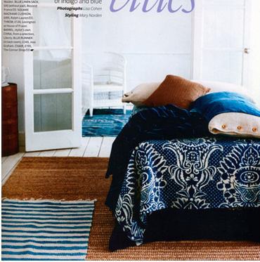
photos by lisa cohen


It's like diving into a ocean of decor.

Summertime Blue(s)

Blues are such a breath of fresh air in the summer heat - they refresh and cool a space, and can bring a surprising pop as well...
An easy way to add a bit of blue to your own home for the season? Start a little collection of new and vintage vessels in varying shades... Textured blue walls with quatrefoil mirrors seem to be doing it for me... adding a touch of exotic decor or detailing helps puts a traditional color in a different light.Want to go for something a bit unexpected? Treat a thrift store chair to a little makeover in a strong shade of aqua - a perfect compliment to warm woods and whites.

For more fresh blues on a monday morning... check this out.

*rooms via madebygirl, james merrel, la dolce vita, amanda nisbet, nuevo estilo

Summer Entertaining: Blue + White

How perfect would these dishes be to add to your summer dinner repertoire?


Slightly reminiscent of my favorite Hermes pattern, but obviously not the same thing. I love the addition of the greek key to mix things up a bit, and they're fairly affordable too, since they are from Z Gallerie. Perhaps for something of a nautical theme? The crisp white and blue always seem like they belong on a yacht to me...

Color Me (Fashionably) Blue

Completely inspired by the bedroom below, I'm loving the intensity and freshness of a pop of vibrant blue against white... with a touch of creamy taupe and glamorous gold to warm things up.
blue gold cream white
photography by ryan michael kelly, room via domino, photo via garance dore, textiles by madeline weinrib