Showing posts with label color palettes. Show all posts

MY SPRING PALETTE: APRICOT + BLUE

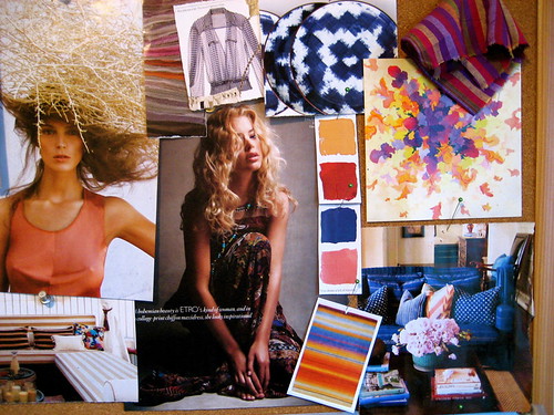
It's official - I'm making this my spring color palette inspiration:
spring fashion color palette blue apricot coco+kelley
I've already purchased a pair of apricot shorts and a very peachy little belt from Anthropologie, and I adore the way it looks with a pop of blue (any shade will do!). Which is funny because this was what my inspiration board looked like for last spring...
2010 - 225
Basically the same line of thought, but a little richer, with indigos and clay reds. I guess I should really start following my own advice a little sooner when making wardrobe purchases! I like freshening it up with black and white accents though - much more current!


*image ali stephens for elle france (source unknown) and inspiration board by coco+kelley

PERFECT PALETTES: SWEET SEPTEMBER

I always find it funny when my posts for the week are so complimentary of each other... I think you'll recognize some hues from these palettes, which can only mean that they truly are fabulous... right?
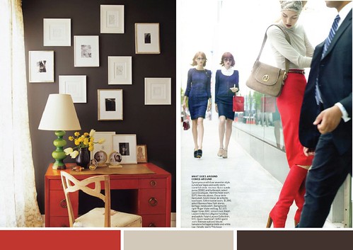
fall pallette inspiration red dirty white brown
Rich chocolate calms the intensity of ruby red and the cool taupe adds a cozy but light feel. Perfect for classically tailored rooms and ensembles!
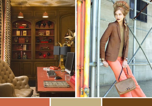
fall pallette inspiration coral taupe caramel
I'm adoring the richness of bronze for fall - paired with an unexpected coral is stays current and fresh!
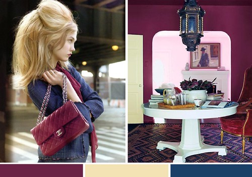
fall pallette inspiration indigo fuscia buttercream
Mmmm, very berry, don't you think? The saturated plum and teal gets a little lift with a rich cream! Especially loving this combo for inspired tabletops right now too!

*editorial images by raymond meier, interiors via unknown, jay jeffers and domino

IN A FRESH + BLUESY MOOD...

Something about summer always inspires a mix of high contrast whites with worn woods and saturated blues...
sixx design via moodboardlonnyPicture 22
The next best thing to lounging by the pool or spending a day at the ocean?  Bringing the colors and textures of both into the home with a sophisticated twist.

*spaces via sixxdesign and lonny

PALETTE INSPIRATION: AQUA + RUST

Unexpected color combinations can be inspired by many things, but I especially love when they come from you!

Not too long ago, I had a reader email me asking for suggestions on how she might work with a room in her rental that she had just moved into with rusty, burgundy walls (which, sadly, she could not paint!). After a few moments of brainstorming I recalled some recent pieces of inspiration that presented the perfect option...
While I rarely choose red to work with in a home, I really do love the way a fresh aqua modernizes what can definitely be a very rustic or retro color. My head is already scheming with ideas for creating fashionable brick fireplaces by flanking them with aqua urns, or bringing old rusty leather chairs to new life with an icy blue throw pillow. And of course, since I happen to own a few aqua pieces, I can now confidently picture bringing them into my fall wardrobe by layering on bits of burgundy.

What do you think? Is it a palette you'd dare to try?

*rooms via celerie kemble and domino, fashion photography by daniel jackson, wrap top by issa, earrings by oscar de la renta, bag by chloe, and scarf by armand diradourian

PALETTES + PATTERNS TO INSPIRE INTERIORS

Not only am I loving the styling and wardrobe inspiration in these photos by Derek Kettela, but they're providing some palettes worth serious consideration...
While I won't be parading this look all over the streets this summer, I would love to bring this palette into my home and wardrobe! The ability of these colors to at once be warm, soothing, and playful makes them a perfect combo. And using the texture of the mosaic somehow in the decor would only serve to enhance the style.
While the colors above may be a bit too pretty for my boy and I to live in together, a little switch of pale pink for rich blue, and a muddy taupe make this inspiration an overall hit. I'm even digging the flamestitch pants, and the killer accessories certainly help bring it all together - translating this into a room would be such fun!
The combination of textures and patterns in this look is so fabulous, but the palette is what makes it luxe. These rich tones paired with black would make for a dramatic room in the house... and I love that there's still that little pop of coral in her nails. A perfect little accent!

SERIES SUBMISSION: HISTORY REPEATING

When I told some of my other blogging friends that I was putting out an open call for blog series contributor applicants, a few of them thought I was fairly crazy. But receiving posts like this from bloggers I've never heard of is exactly why I did it! Meet Courtney Hathaway - the blogger behind Dainty & Floral. As a design student studying abroad in London her passion is infectious and her eye for design well beyond her years. Enjoy!
As you may heard time after time, that history does repeat itself and that is not all a bad thing especially in the design world!
Legendary American interior designer, Albert Hadley has absolutely flawless style when it comes to arranging a room in terms of color selection, furniture styles and the perfect balance of artwork. I thought his designs were very fitting for the sun filled spring days and just in the nick of time for some quick spruces throughout the home.
I for one, am a HUGE fan of color and love his use of just the right amount of "pop" in each space. I absolutely love what he did with the bedroom--placing a rustic teal bed frame against a dark grey canvas--genius! It is no wonder that the image of him flipping through Domino would be intriguing to him, all of his design choices fit perfectly with the magazine's aesthetic (RIP Domino but thank goodness for the online LonnyMag to fulfill our hungry design eyes!)
Bravo Albert Hadley! If you are craving more of Hadley's work be sure to check out his book, The Story of America's Preeminet Interior Designer where the designer simply explains..."I deeply believe that a beautiful decor can have a beneficial influence on our lives".

I couldn't agree with the man more. Hope you all are finding lots of cheery inspiration on this April day!

A fabulous little entry, Courtney. Thank you for bringing the beautiful work of Albert Hadley to coco+kelley!

WEDDING INSPIRATION: HIGH DRAMA

All this talk of black+white the last few days reminded me of a wedding palette I had started on quite some time ago based on a post I did on the fabulously dramatic and unexpected combination of coral+black. I thought it was high time I finish the inspiration board and share it with you all!
I adore the idea of an elegant soiree with a little Spanish influence. Casually thrown together but vibrant floral arrangements in a candlelit castle. An intimate little affair with a slightly sexy side. The coral is such a fun and original pop. Can you picture it?

*images (clockwise) via: saipua, amorology, rifle paper, southern weddings, amorology, and unknown.

A WHISPER OF SPRING

The days here have been cool and wet, inspiring subdued shades of spring. Whether the grey provides a muted backdrop to quiet celedon and pale pale pink...
celadon grey cream pink1
Or fresh whites and warm creams help bring these colors to life...
celadon grey cream pink2
The palette is that feeling of foggy spring mornings that turn to soft afternoon sunshine. The perfect type of day to be just a little bit lazy...

*images via saipua, unknown, sharyn cairns, martha stewart, domino, lonny, domino, and james merrell

LOVE IS IN THE AIR...

I know I'm a little ahead of myself with this post, but for the first time in years I'm actually excited for Valentines Day. Not because of the holiday (it makes me cringe), but because it will be the one-year anniversary of my first date with the boy! So, needless to say, I'm actually looking forward to celebrating...
Combining my love for these spring trend colors (from pantone) and a peach+red Valentine's day combo, I'd love to start the evening in a fabulous dress, and end up in those adorable and comfy ruffle cami and shorts. Preferably with some love notes, jewelry, and pillow talk in between! So, thank you for indulging my slight twitterpation with this usually despised holiday this year my dears... it will be special one for me!

TRANSITIONS

I'm loving this palette of forest and emerald greens meeting nude and apricot tones as the perfect transition from winter to spring...
Just a hint of each goes a long, long way...
As if to prove my lust, I discovered this perfect inspiration photo via the sartorialist today - my favorite girls. Viviana even has the gloves I'm wishing I bought this winter (from banana, and no longer available). I'm sure hers are from somewhere much more extravagant and lovely.

*boots at anthropologie by frye, earrings philippe ferrandis

HOLIDAY PALETTE: AQUA + GREEN

One of the consequences (or perhaps perks?) to having moved so many times is that my holiday decor tends to change with my surroundings every year. I usually have a very small tree and a very small space to work with, so am always switching things up. And my favorite prospect for this year??
So fresh! So fun! So holiday without being obvious! I love the combination of aqua and green - especially with a sparkling dash of white.

Do you stick with a holiday decor palette or look every year, or switch things up??

And speaking of holiday... a few of you have asked about a gift guide, and yes, it's coming!!!

*image via black*eiffel, holiday ensemble by apiece apart, slippers at kate spade, pillow by dransfield and ross, ornaments at crate&barrel

HAPPY WEEKEND! (AND SOME HOLIDAY INSPIRATION...)

I've been thinking about how I'll be decorating our family's Thanksgiving tabletop, so I spent some time yesterday searching for inspiration. What came out of it is this subdued palette of soft champagnes, plums and silvery blues with rich chocolates, navy and black for drama.
A crystal chandelier and sequined dress for sparkle. Rich tapestries, and luxurious bits of velvet, furs, feathers and tulle for texture. With a touch of bold pattern and golden roses for the unexpected twist.

What do you think? It's more of a winter palette, I know. But, I wanted this year's tabletop to feel calming, but with lots of sparkle. Plus... I'm going to be using way more color for Christmas!

How about you? Have you put some thought and design into your holiday tabletops yet? I'd love to hear what everyone will be doing!

xo, cassandra

*images via
inside out, etsy, vogue india, and unknown

November Palettes

One to inspire rooms and wardrobe choices this month...
And the other for rich autumn tabletops...
I can't wait to use them both!

*rooms via met home and mary mcgee

Ravishing Raspberry

Apparently my renewed love for red also includes its close cousin, raspberry...
Not to mention my never-ending adoration for zig-zag pillows or fabrics.

*interiors by suzanne kasler and via martha stewart

Primary Palettes

While I don't think many of us would run to decorate any space in primary colors, when your basic red, yellow and blue take on different shades, the color combo can become surprisingly sophisticated...
I have always loved this shot of Keira Knightley from one of my favorite editorials (and I'm not really a huge fan of hers) because I adore the mix of styles here - preppy safari meets bohemian is how I suppose I'd summarize it, which is exactly how this room via House Beautiful comes across to me. Refined, but worldy (and perhaps a tad overwhelming? I'll let you be the judge). It got me thinking about how I'd recreate this palette in my own home - starting with that pillow from Koko Company. A shade of blue that looks more grey, a golden mustard yellow and a more coral tone of red. Then I stumbled upon this photo in my archives and thought - now that combo has serious potential. Again a more retro golden shade of yellow, a pure bright red, and a gorgeous teal blue. Anchored by black and beige, it's a winning palette - and almost perfectly represented in this room via Canadian House & Home - all it needs is a touch of the blue! Rich and intense, the amount of beige (and light!) in this room keeps the palette from becoming too heavy.

Retro Palettes + The Next New Neutral

I've been mesmerized by the colors in these photographs for Vogue Italia by Steven Meisel for months now, but wanted to wait to use them for some late summer inspiration for one very good reason... olive green.

When we think olive green, our minds usually wander to visions of tuscan decor or army fatigues, but the truth is that olive toned browns, khakis and greys make an excellent pairing with brighter colors, offering a perfect way to transition all your summer clothes to fall or provide an unexpected accent to saturated decor.
A beachy palette of orange, blue and yellow gains depth with the addition of olive greens.In this case, shades of olive green draw together peaches, red and pale blue - not an easy color palette to get away with! Feminine pinks and baby blues suddenly become grown up with the addition of olive and mustard.Mauves and blues could be a bit boring on their own, but the olive gives this palette a whole new spin.

I've already invested in an olive toned khaki cardi for fall, and you better believe I'll be adding more of this color to my wardrobe!

Wedding Inspiration: Lilac + Aqua + Emerald

The latest issue of Harper's Bazaar features the fabulous Alberta Ferretti and her home - one photo of which I could not resist! The stunning colors that captured the designer by her pool inspired this wedding board of lilac, aqua and emerald...
I love the cool but playful palette! There are so many ways to incorporate colors into a wedding, but for this board I kept them in blocks - the colors stay mostly separate from each other by using them in different areas of the wedding instead of combining them in bouquets or tabletop decor. What do you think? Have you ever seen a wedding in this scheme?

*sources: pool via michele waite, drinks by martha stewart, cake via rebecca thuss, flower aisle by kathy wright & co, wedding party by michael norwood, teal tabletop unknown.

Use Your Words

I always say that inspiration can come from anywhere. In this case, a few of my favorite prints (whose quotes should be gracing my walls) sparked these fresh mood boards...
*photo patrick demarchelier, quote keep calm ltd, flowers laura resen, fabric schumacher

*photo via vogue, quote the love shop, shoes valentino, wallpaper cole & son

*quote the love shop, room laura resen, photo via here, fabric schumacher

I've been so incredibly drawn to black+ white these days, but I have to say that red+nude? Always so classy.

My Perfect Summer Dress

Yes, it's true. I've found it. The dress I should have been wearing all summer long! While the cut and style are pure sweetness, it's the colors that really have me swooning...

In case you haven't noticed my obsession with the pairing of every possible shade of coral with blues, greens, and yes, even a little black, you haven't been paying attention. This dress combines all three into one beautiful garment by Catherine Malandrino, and I couldn't love it more. And, since I had a few more interiors sitting in my files that show off the palette...
*rooms via domino, alan higgs, kelly wearstler, pierre jean verger, philip galanes

Summer Flavors: Lime + Nectarine

The latest inspiration for my home? These shots from photographer Johnny Miller...

Colors drawn from cool summer drinks. You've gotta love that, right? The zig zag rug in green is perfection... and I may have to hunt it down for the living room! (Psssst, this palette is also inspiring me for another project I'm working on... hmmmm....)