For the first time in months I have a weekend with nothing planned...
After a crazy week of work and feeling quite under the weather these last few days, I think it's time to renew my relationship with my bed, get through my piles of laundry and catch up on LOST before the series finale. Sometimes big glamorous plans are overrated... I'm ready for a weekend at home! See you next week with the final series submissions for contributors (I can't wait to get them started!), and some fantastic little finds I'm excited to share...
xoxo,
cassandra
Showing posts with label neutrals. Show all posts
ANOTHER SHADE OF PALE
Last week I highlighted a beautiful editorial that featured washed out nudes and silvery blues, and I'm still loving the idea of this softer palette for spring. While I tend to cringe (and have horrible flashbacks of the 90's) every time I hear 'pastels' and 'trend' in the same sentence, I will say that the sweet, romantic quality of a pale palette has a certain level of appeal...
Back in high school I purchased a periwinkle blue dress that I never wanted to get rid of. I kept it in my closet for years after I was done wearing it simply because I loved the color so much. These heels from Brian Atwood have that same tone, but softer with a hint of grey, making me totally covet them. The gold studs contrast so beautifully! The dreamy quality of the Donna Karan chiffon dress paired with a ridiculous (that is the only way to describe her pieces) Judith Leiber shell clutch is oh so beachy cool.
I know I've been overdoing it with the nudes lately, but I had to feature these fabulous pieces because of the way they're glamorously paired with black, bringing an edgy nightlife-worthy quality to the soft tone. The textured layers of the dress by Camilla and Marc, the slightly coppery tone in the Lanvin clutch (yes that's a fabric covered chain) and the Burberry Prorsum strappy sandal are all worthy of a summer evening on the town.
Oh, dear gray. Aren't we sick of you yet? We should be, really. And yet... there's something so fantastically classic about you, we simply cannot walk away! A perfect spring alternative to the LBD, a Grecian-inspired Stella McCartney gown with amazing detail would make for a fabulous alternative for weddings, while her cork heels would bring the satin sandal down to earth for day dressing. You could pair the rough texture of the Valentino clutch with a t-shirt and jeans, and it would make the ensemble. That's the kind of bag worth investing in.
*all pieces available at net-a-porter
Back in high school I purchased a periwinkle blue dress that I never wanted to get rid of. I kept it in my closet for years after I was done wearing it simply because I loved the color so much. These heels from Brian Atwood have that same tone, but softer with a hint of grey, making me totally covet them. The gold studs contrast so beautifully! The dreamy quality of the Donna Karan chiffon dress paired with a ridiculous (that is the only way to describe her pieces) Judith Leiber shell clutch is oh so beachy cool.
I know I've been overdoing it with the nudes lately, but I had to feature these fabulous pieces because of the way they're glamorously paired with black, bringing an edgy nightlife-worthy quality to the soft tone. The textured layers of the dress by Camilla and Marc, the slightly coppery tone in the Lanvin clutch (yes that's a fabric covered chain) and the Burberry Prorsum strappy sandal are all worthy of a summer evening on the town.
Oh, dear gray. Aren't we sick of you yet? We should be, really. And yet... there's something so fantastically classic about you, we simply cannot walk away! A perfect spring alternative to the LBD, a Grecian-inspired Stella McCartney gown with amazing detail would make for a fabulous alternative for weddings, while her cork heels would bring the satin sandal down to earth for day dressing. You could pair the rough texture of the Valentino clutch with a t-shirt and jeans, and it would make the ensemble. That's the kind of bag worth investing in.*all pieces available at net-a-porter
Labels:
fashion,
fashion inspiration,
neutrals,
pastels
ROOM OF THE WEEK 2.18
An oldie, but a goodie, this room from the much-missed Domino mag is one of my favorites, and it just felt right as a perfect transition room to highlight this week as we move from cool winter tones to fun pops of color for spring!
The scaled down furniture helps keep this smaller area feeling open as does the muted palette, but the fun colors come from the small accent bench and the piles of books. How perfect would a huge bunch of peonies be sitting on that coffee table, too? So fresh!
Labels:
living room,
neutrals,
room of the week
ROOM OF THE WEEK 1.14
Speaking of breezy style...
I have no recollection of where this image came from, but it's so where I want to be right now, that I had to use it anyway. Plus I love the subtle use of stripe and grid patterns. Minus the hide rug (I just can't get into those) I'd take it all. Especially that little veranda... Oh how I'm craving some much needed sun!
Labels:
bedroom,
neutrals,
room of the week
ROOM OF THE WEEK 11.19
While many of the spaces I choose for the Room of the Week have that 'wow' factor... sometimes it's nice to remember how lovely a simple little nook can be...
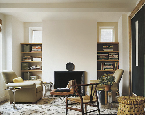
A little more realistic and achievable for majority of us, spaces like this room from one of my favorite designers - Tom Scheerer - help me feel like I'm clearing my head. The neutral palette is very much in line with my own style. I also love the textures here. The use of chrome in all the side tables combined with more organic textures to keep warmth in the room is a wonderful balance. The absence of art above the fireplace... I normally wouldn't like, but it works in this room, making the space feel less cluttered and taller than it really is. (Of course, if I lived there, I'd probably put up a very simple mirror...) On top of all that - it's such a great example of what to do with those random little rooms we sometimes end up with in houses. It's so important to create a space that is inviting and usable in those type of spaces, or we'd never hang out there! I think Tom does an amazing job of doing that in this room.
On a totally separate note... do you ever take the time to read about how interior designers describe themselves on their websites? I love this description about Tom:
His work is characterized by clear and logical architectural solutions combined with beautiful, comfortable furnishings. He emphasizes furniture planning, spatial relationships, color and texture over the ornate or purely decorative. He has a keen appreciation for art. While he is fluent in various styles, he prefers to use antiques sparingly and succinctly within a context of what he labels "relaxed modernism." His fore bearers in the trade are Billy Baldwin and David Hicks, masters of fresh, civilized, beautiful, unpretentious spaces.
Exactly.
A little more realistic and achievable for majority of us, spaces like this room from one of my favorite designers - Tom Scheerer - help me feel like I'm clearing my head. The neutral palette is very much in line with my own style. I also love the textures here. The use of chrome in all the side tables combined with more organic textures to keep warmth in the room is a wonderful balance. The absence of art above the fireplace... I normally wouldn't like, but it works in this room, making the space feel less cluttered and taller than it really is. (Of course, if I lived there, I'd probably put up a very simple mirror...) On top of all that - it's such a great example of what to do with those random little rooms we sometimes end up with in houses. It's so important to create a space that is inviting and usable in those type of spaces, or we'd never hang out there! I think Tom does an amazing job of doing that in this room.On a totally separate note... do you ever take the time to read about how interior designers describe themselves on their websites? I love this description about Tom:
His work is characterized by clear and logical architectural solutions combined with beautiful, comfortable furnishings. He emphasizes furniture planning, spatial relationships, color and texture over the ornate or purely decorative. He has a keen appreciation for art. While he is fluent in various styles, he prefers to use antiques sparingly and succinctly within a context of what he labels "relaxed modernism." His fore bearers in the trade are Billy Baldwin and David Hicks, masters of fresh, civilized, beautiful, unpretentious spaces.
Exactly.
Labels:
interior design,
living room,
neutrals,
room of the week
Room of the Week 9.3
As we slowly, reluctantly move into fall, I find myself wanting to pull in richer colors (my rooms have been very neutral with accents of pale blues and touches of gold all summer). So, I've been collecting color schemes in my head, and this cozy dining room seems to be just about perfect...
You may remember that I started a little Domino Magazine pool right after our *sob* favorite glossy folded, and that is where I rediscovered this beautifully understated room. Sometimes I kick myself for purchasing so many furniture pieces in neutrals, but this room (once again!) proves how smart this strategy is - especially for designers on a budget! By changing the accessories, the mood can be totally transformed. Take away those saturated blue drapes, the bowls on the mantel, orange artwork and accents on the table, and you've got a completely clean slate to work with!
Since moving in with the boy, I have been trying to incorporate more blue (his favorite color as far as I can tell), and I myself have been drawn to corals, pinks and oranges. While this space is a bit more traditional than I'd normally be attracted to, the clean furniture lines help it feel somewhat modern, and I'm dying for that chandelier! Interesting that they chose to use something mounted vs. hanging, no? Above all, I love that the room still feels very fresh and simple - something I always aim for in my designs.
You may remember that I started a little Domino Magazine pool right after our *sob* favorite glossy folded, and that is where I rediscovered this beautifully understated room. Sometimes I kick myself for purchasing so many furniture pieces in neutrals, but this room (once again!) proves how smart this strategy is - especially for designers on a budget! By changing the accessories, the mood can be totally transformed. Take away those saturated blue drapes, the bowls on the mantel, orange artwork and accents on the table, and you've got a completely clean slate to work with!Since moving in with the boy, I have been trying to incorporate more blue (his favorite color as far as I can tell), and I myself have been drawn to corals, pinks and oranges. While this space is a bit more traditional than I'd normally be attracted to, the clean furniture lines help it feel somewhat modern, and I'm dying for that chandelier! Interesting that they chose to use something mounted vs. hanging, no? Above all, I love that the room still feels very fresh and simple - something I always aim for in my designs.
Labels:
blue,
neutrals,
orange,
room of the week
Rooms From the Runway: Changing Seasons
While I love this cozy Pre-Fall runway style from Missoni, I'm quite tired of the winter right now, so I'm translating this look into a summery room instead! (Sorry, I've forgotten the source, so please let me know if you recognize it!) I love the mix of glam (mirrored tables!) with clean lines and natural fabrics in neutrals. And, best of all, I think the space still evokes a cozy image of late evenings spent around the fire. In fact, I think a Missoni throw made from the same fabric of the dress and coat would fit right in!Oh summer.... are you here yet??? February is going to be a very long month...
Labels:
neutrals,
rooms from the runway
Color Predictions from {this is glamorous}
Last week, we had a fantastic lineup of guest bloggers posting on their color predictions for 2009 as we crown our own Color of the Year.
Today, I'm so happy to introduce the always inspiring {this is glamorous}. This series wouldn't be complete without a little forecast featuring the gorgeous images she is known for putting together so perfectly...
While I adore luminously white rooms with vibrant splashes of color, will always be drawn to softly welcoming neutrals and elegant grays warmed with delicate touches of color . . .
image: domino magazine
image: elle decor september 2007
image: she sells...
Would love to see more of the pink-hued lavenders and dusky roses that having been seeping onto the runways and into interiors this season.
Seems like we have another vote for pink in the house! I'm in love with the last bedroom in this set - the subtle inclusion of color in the all-white space is just fantastic. Thank you so much {this is glamorous} for joining in on my little week of predictions! I'll be sad to see it go ~ I think I could keep doing this for the entire month with all the amazing photos and collections we've been seeing! More this afternoon, my dears...
Today, I'm so happy to introduce the always inspiring {this is glamorous}. This series wouldn't be complete without a little forecast featuring the gorgeous images she is known for putting together so perfectly...
While I adore luminously white rooms with vibrant splashes of color, will always be drawn to softly welcoming neutrals and elegant grays warmed with delicate touches of color . . .
image: domino magazine
image: elle decor september 2007
image: she sells...Would love to see more of the pink-hued lavenders and dusky roses that having been seeping onto the runways and into interiors this season.
Seems like we have another vote for pink in the house! I'm in love with the last bedroom in this set - the subtle inclusion of color in the all-white space is just fantastic. Thank you so much {this is glamorous} for joining in on my little week of predictions! I'll be sad to see it go ~ I think I could keep doing this for the entire month with all the amazing photos and collections we've been seeing! More this afternoon, my dears...
Labels:
color trends,
color week,
grey,
neutrals,
pink
Subscribe to:
Posts (Atom)


