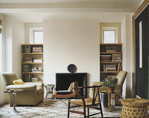
 A little more realistic and achievable for majority of us, spaces like this room from one of my favorite designers - Tom Scheerer - help me feel like I'm clearing my head. The neutral palette is very much in line with my own style. I also love the textures here. The use of chrome in all the side tables combined with more organic textures to keep warmth in the room is a wonderful balance. The absence of art above the fireplace... I normally wouldn't like, but it works in this room, making the space feel less cluttered and taller than it really is. (Of course, if I lived there, I'd probably put up a very simple mirror...) On top of all that - it's such a great example of what to do with those random little rooms we sometimes end up with in houses. It's so important to create a space that is inviting and usable in those type of spaces, or we'd never hang out there! I think Tom does an amazing job of doing that in this room.
On a totally separate note... do you ever take the time to read about how interior designers describe themselves on their websites? I love this description about Tom:
His work is characterized by clear and logical architectural solutions combined with beautiful, comfortable furnishings. He emphasizes furniture planning, spatial relationships, color and texture over the ornate or purely decorative. He has a keen appreciation for art. While he is fluent in various styles, he prefers to use antiques sparingly and succinctly within a context of what he labels "relaxed modernism." His fore bearers in the trade are Billy Baldwin and David Hicks, masters of fresh, civilized, beautiful, unpretentious spaces.
Exactly.


