Showing posts sorted by relevance for query aqua. Sort by date Show all posts

More Aqua...

Apparently I'm on an aqua kick...


I bought these deep plum colored dahlias last week and put them in my aqua glassybaby because I didn't have the right vase... and I am totally loving the color combo. Then, I found this vintage handkerchief on ebay and got into a little bidding war for it (I lost).


But I did find some more inspiring images for your viewing pleasure! This is definitely a way to bring aqua into the fall color palette...


(Top image via decor8, bottom left via Domino, bottom right via Skona Hem.)

INTERIORS TO INSPIRE: GLAMOUR IN PASTELS

Hello Lovelies! Julie from Chapman Interiors here bringing you a true Hollywood Glam home today. Designer Jay Jeffers is responsible for the fresh color palette brimming with coral and aqua and unique details that create some real personality in these rooms. Let's check it out!
I am dying over the windows softly traced in that aqua (presumably to call more attention to the fabulous architecture) . The mushroom colored settee is a departure from the expected sofa, giving the light permission to flood right in where a sofa back would usually be cutting it off. Fluffy white pillows reinforce the glow.
There is sparkle everywhere! The tiny mosaic tiles (in the same appropriate aqua!), bubbly mantle piece, benches floating on lucite legs, chrome coffee table base, silver candle sticks in the fireplace... all together these accents shout glitz and glamour (and yet the room seems to seductively whisper, don't you think?).
This chandelier makes me giddy! The delicate vertical elements pair perfectly opposite the glowing glass bubbles reaching for the table. The coral ceiling and wall trim are a great way to introduce color without being forced to paint an entire wall. I think those tulips may have been custom dyed... they're too perfect!
The dining table being set at an unexpected angle and the fun zebra sideboard make the space dynamic and exciting (Bonus: It's fairly easy to change the material on the sideboard on a whim! This is an easy and impactful way to bring in some bold graphics without spending a fortune).

In using this style to inspire your space,

* Consider painting your trim an aqua color and letting the walls take a back seat in ivory.

* Choose an art deco inspired occasional chair in a patterned upholstery. Leave the wood very dark or have it refinished with a dark lacquer.

* Add a few patterned upholstered pieces that don't match each other perfectly. Even better if the material has a little splash of metallic.

* Furniture should rest on a thin leg (or even a lucite leg!) to impart a light and airy feeling.

* Accent with a soft coral, grays, aquas and tans.

* Don't forget a dash of sparkle and glam, after all, this is a Hollywood home!

You'll get a little something like this...


And there we have it!  Hollywood is knocking...

xoxo

-Julie

*resources: chandelier, gold pillow, coral pillow, Benjamin Moore Heavenly Blue #709, white settee, glass coffee table, deco tray, 1st dibs vintage chair.

PALETTE INSPIRATION: AQUA + RUST

Unexpected color combinations can be inspired by many things, but I especially love when they come from you!

Not too long ago, I had a reader email me asking for suggestions on how she might work with a room in her rental that she had just moved into with rusty, burgundy walls (which, sadly, she could not paint!). After a few moments of brainstorming I recalled some recent pieces of inspiration that presented the perfect option...
While I rarely choose red to work with in a home, I really do love the way a fresh aqua modernizes what can definitely be a very rustic or retro color. My head is already scheming with ideas for creating fashionable brick fireplaces by flanking them with aqua urns, or bringing old rusty leather chairs to new life with an icy blue throw pillow. And of course, since I happen to own a few aqua pieces, I can now confidently picture bringing them into my fall wardrobe by layering on bits of burgundy.

What do you think? Is it a palette you'd dare to try?

*rooms via celerie kemble and domino, fashion photography by daniel jackson, wrap top by issa, earrings by oscar de la renta, bag by chloe, and scarf by armand diradourian

A HAMPTONS AFFAIR: NAVY+AQUA

Let's end this week appropriately, shall we? Since I'm heading to what I can only imagine will be a fantastic wedding reception on Saturday, I'm in a celebrating mood, which can only mean one thing - time to highlight some fabulous event decor! This one falls right into the theme of the week - perfectly pretty+preppy with a whole lot of color punch!
A seaside affair in the Hamptons, this wedding was designed by Amorology and might be one of my most favorite ever with their choice of navy and aqua palette, tons of beautiful details, and tabletops to die for!
When even the pillows match the theme, you know you've done something right. I adore this bouquet of garden roses, chocolate orchids and a few simple sprays that lend a casual elegance to the bunch.

This might be my most favorite boutonniere ever! It's like a teeny bouquet in itself. The simplicity of the groomsmen's pieces combined well with their graphic ties... which definitely tied into the theme of the event! And the loafers... too perfect. The girls looked perfectly chic in all navy topped by their little cardis that mimicked the lines of the bride's own dress.
For me, though it's the tabletops that steal the show! I love the way they combined the navy + white stripe with the solid aqua, that stunning orchid planted seashell, and the super sweet wicker basket vases. The casual arrangements are perfectly in tune with the seaside location too.
Whether you're planning a wedding or not, this setting is so summer inspired, I'm already planning the next Table for Two feature in my head around this color scheme! If only I had a beach to host it on!

*photography by amelia lyon

Rooms from the Runway

Once again, I return to the runway for inspiration. I loved these two pieces from Balenciaga's Fall 2007 Ready to Wear Collection ~ probably because they allow to me incorporate that little pop of aqua that I've been decorating with for so long (and am ready to phase out... a little).


This is an incredibly eclectic look. The layers of fabric make it bring a bohemian vibe while the bold black and white pattern almost looks a bit tribal. The gold details, however, add a deco glam that was so popular in fall collections. A touch of fringe and the lace up boot lends to a more classic look, and the pop of aqua is totally unexpected. Just imagine what this room could look like...

Let's start with the couch ~ I picture something in a deep caramel in a luxurious fabric like velvet or mohair... something like this piece from Jayson Home & Garden with a simple but classic shape.


To bring in the black and white, I'd choose some accent chairs with strong shapes like this one from Barbara Barry...


... or the Sam Chair from Oly


Maybe an accent bench in a classic deco design on the other side...?


This one is a Karl Springer design I found on 1stdibs.

To complete the room, we need the pop of aqua... and I think I'll do it in the rug!

Don't hate me, but I'm completely in love with this piece I also found on 1stdibs. It might remind you of you mother's (or grandmother's) disgusting shag carpet, but I think it has really great organic texture...


And of course, to top it off, a large coffee table - I was picturing a solid piece of burlwood, but found this piece (also on 1stdibs - forgive me!) that had a touch of gold and thought it might be just perfect...


Pull these pieces together with some accessories, and look what we've got!


(Lamps from 1stdibs, pillow from Sleeping Buddha)


(Pillows from Madeline Weinrib, lamps from 1stdibs, variety of vases from Jayson Home & Garden, bowl by Caleb Siemon.)

Kelley Proxmire

I've been meaning to highlight the talents of east coast Interior Designer Kelley Proxmire for nearly a month now. Her style is impeccable. Her look traditional, yet bold and clean. I absolutely love her rooms, so here are a few of my favorites for your enjoyment and inspiration...


One of my favorite color combinations, the aqua and chartreuse pop against clean white. Notice how the shades create a casual contrast with the tailored window dressings, how the modern lucite table adds a special lightness to the room, and how the little pops of aqua and chartreuse repeated in the accessories really keep your eye moving (the plants, aqua candlesticks, the lamp base, and even the artwork) while still creating a cohesive color scheme.


The current color of the moment - yellow! - with black and white. Simple, sophisticated, yet sunny and welcoming. While I might have made some different decisions, like a more modern yellow fabric for the chair pillows, a cute little vintage glass chandelier, and definitely a different print for the wall, the basic elements in this room are fantastic, and the drapery is absolutely stunning.


This one is my absolute favorite. The comfortable indoor/outdoor space again has a sophistication not usually found in these more casual areas. I love how the black trim on the curtains and walls frames the whole porch, and is mimicked in the strong lines of the lantern and pillows. The pops of red are just enough color to complete the look. Remember, a little red goes a long way when decorating. Use it purposefully for the greatest impact.


I never knew black walls could work so well with a beach theme! The coral above the fireplace is picked up in the pillows on bed and chairs featuring seashells (I know, it's hard to see). The heavy drapes around the bed and lighting inside topped of by a bold mirror make the bed it's own little room. An extremely dramatic take on beach chic!

Coral Coral Everywhere...

Just when I think I might actually be getting weary of the coral motif, another fabulous pieces catches my eye and I'm head over heels once again.


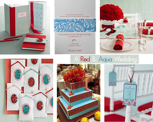
This gorgeous candelbra from Driade is brought to you courtesy of my friend Sheena at Totally Tabletops who posted it in her blog last week. Made of aluminum and lacquered in red, the flat coral shape makes a strong statement. Since I love the combination of aqua with red, I'd be inclined to add a few candles in various heights, including these Ana Candles from Ana Design, which have always been a favorite of mine.


Balance them out with a few candles in solid ivory and aqua.


Just to illustrate my point, I thought I'd include this room from the current issue of House & Garden. A Florida house by designers William Diamond and Anthony Baratta, this trellis credenza was custom built and perfectly demonstrates how to combine beach style with high glamor. Click the link to see the rest of the home.

Under The Sea, Over The Top?

In the process of going through the latest couture shows, I discovered designer Zuhair Murad's collection of gowns dripping with coral, starfish and other ocean-inspired details...
coral and aqua rooms from the runway2
While this dress makes a fabulous entryway, I don't know that I'd have an appropriate occasion to wear it to in my lifetime. I do, however, wonder what you think of the rest of these as 'alternative' wedding dresses...?

starfish wedding dress and tabletop
An all-white tabletop set with starfish at each place setting would compliment this gown's somewhat subtle, yet sparkly starfish detailing.

zuhair tabletop
This dreamy dress would flow beautifully on a sandy beach with its pale aqua beaded coral weighing down the bottom. An au natural tabletop with a hint of beach glass blue would do perfectly to match.

zuhair beach
Or, imagine a more dramatic contrast with a constructed mermaid dress in grey and a modern, elegant beach reception. Who says you can't get fancy in bare feet?

Well, would you do it? I have to say... I just might!

WARMLY WORN + LACQUERED AQUA

One gorgeous combination...
The way natural wood contrasts with high-gloss laquer aqua is putting me in a fresh and inspired mood this Monday morning! Adding layers and layers of warmly worn books just adds to the beauty.

*images via skona hem and sfgirlbybay

Urban Electric

Last week on Decor8, Holly featured a piece (actually a few!) on the Emperor's Lamp by Design Dessert (you can see her post here).


The simple lines created by the silhouette of this lamp reminded me of a piece I've always loved by the Urban Electric Company...


The Anson Ribbon pendant lamp is a statement piece in this bright aqua, but its thin metal construction keeps it from feeling to heavy or overwhelming. I would love to see this piece in a room of red and aqua - maybe a fun kitchen or dining room! Plus, what a great DIY project to spray up an old chandelier (how many of these have you seen in the thrift store?) with a fun and bright color?

Some other favorites from the same company, whose pendants and sconces are offer a wonderful selection if you're in the market for lantern inspired pieces or clean and simple lines.


The Carlyn (sexy and sleek) and the Cirque (modern chinoiserie!).


Gunston (love the shape!) and Balfour (love how it blends into the wall).


Maxine (a nice mid-mod piece) and the Lafayette Double (pretty much gorgeous anywhere you put it).

INTERIORS TO INSPIRE: GLAMOROUS MIDCENTURY

Hello everyone! Julie here, from Chapman Interiors. Get ready to be wooed and wowed by this lakeshore  drive home designed by Angie Hranowsky (this woman has some serious talent folks, she also runs a  graphics division for her company). The home is filled with a mix of eras where the cool lines of the modern pieces are offset by a soft palette and a few curvy feminine additions for good measure. The mood is soft and inviting. Let's have a look! 

If Angie confessed that she'd based their entire design on the Donghia Suzani color palette and print, I'd believe her (and I wouldn't blame her - it's a fabulous fabric!). Great design tip: the graphic mid-century modern screen near the front door is complimented by the vintage David Hicks pattern on the danish chair on the left.
A personal collection of art is a fabulous way to share your own personality and taste; it also introduces variation in style and color. (And notice her pieces displayed are within her aubergine/fuchsia/nude color palette? I bet that wasn't an accident!)
 
Simple dining room pieces are livened up with a zebra rug, cute blue ottomans and a perfectly feminine occasional chair. (I do wish the chandelier was larger, or more of a statement piece. She could have done a drippy crystal chandelier and it would have been lovely.)

Well hello again, beautiful suzani! We've seen you before, except now you're center stage. I'm drooling over the chrome canopy bed. It's a completely modern element in the room that would be lacking otherwise.

What an adorable little mid century home (boasting southern California genes). The exterior and interior flow together perfectly, it's always important to reference the architecture when you're designing your interior! (It would have been charming if the front door was the same deep magenta from the Donghia material!)

The most important bits of style here:
* Select pieces that are vintage, often with a straighter line.
* Wood is smooth and finished.
* Use a bold print to guide your color palette choices throughout the rest of the house.
* Create a collected feeling throughout (think gallery wall & vintage modern pieces.)
* Add a dash of chrome.
* A solid dose of graphic pattern will bring things to life (stick with the color palette from your one bold print).

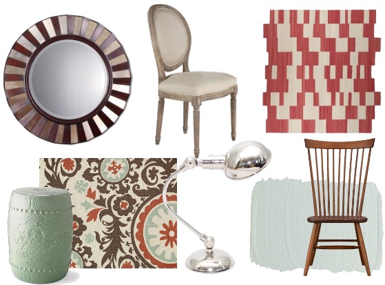
And here's what we get, (for my collection I used the suzani print in the lower corner as my inspiration to guide the other color decisions).

A little celadon, a little wood, a little chrome = a lotta style! I am loving the soft aqua and rusty red (good for moving into fall too...).

xoxo