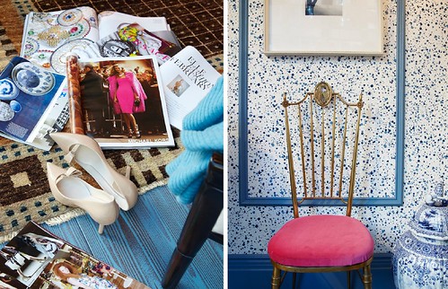
 Well, the sweetheart he is, Eddie sent over some gorgeous detail shots of the window so that we could get an inside peek at the styling! (If you want to see the whole room first, pop over here.) I love the lived-in feel from strewn magazines and his contrasts of antique with modern. The details in the window are insane - like the hand-painted faux bois flooring (the color is Aura, Fiji). And talk about brave - how about that wallpaper! Apparently, Eddie always had a sample of it pinned to his inspiration board at House Beautiful and Martha Stewart, but never had a chance to incorporate it, so when this opportunity arrived, he jumped at the chance...
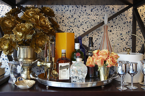
 I think my favorite area of the window might be the bookshelf. Or, should I say, bar shelf? By using the chinoiserie blue vases against the splatter blue wallpaper, Eddie created an eclectic look that's still easy on the eyes. Take that as a tip, m'dears! However, the one part that stands out is the simple bar setup... Check it out.
 I loooooove the vintage brass flowers. I've been eying some at the antique store down the street and this setup makes me want to get 'em asap! Love that he used another condensed color scheme here with the brass and orange, too.
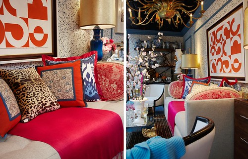
 The main focal point is obviously the sitting area of the room. The sofa, pillows and artwork are completely over the top, but balanced by the fresh white chairs flanking either side. All the colors in the room are used right here, combining bold modern prints with antique textiles and classic furniture lines. The lamps are a stunning blue with custom shades made by Susan Schneider with Shandell’s in Millerton out of goldleaf wallpaper from Phillip Jeffries.
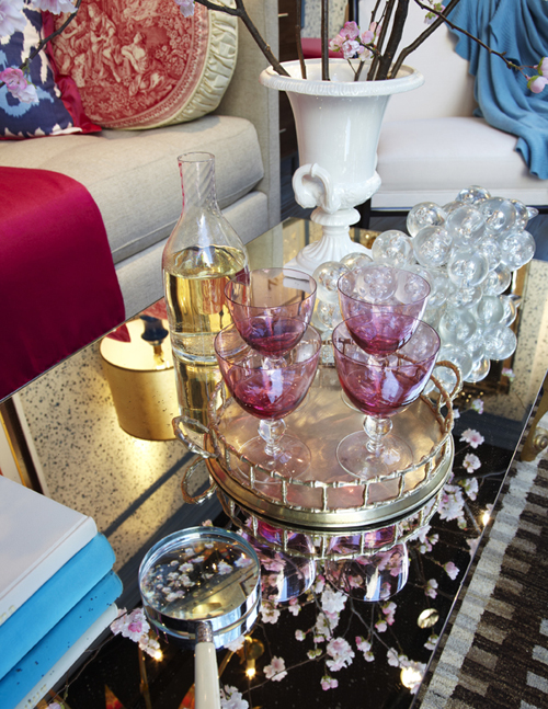
 One thing Eddie and I have in common is our love of entertaining, so of course this room would not be complete without glasses on the coffee table ready to pour! And we all know how much I love a mirrored coffee table.
Now's the fun part people! Hop over to Apartment Therapy to see the other two windows and then cast your vote for your favorite! You can also text your vote to 89800, and use the number 1 to vote for Eddie. (What is this, American Idol???) Obviously, I'm a little biased, but I think Eddie did a fantastic job of creating a window that not only reflects his design aesthetic, but also speaks to the style of Elle Decor. For a little contrast, Maxwell's window is a very cozy saturated library scene. Worth a peek!
*photography by addie juell


