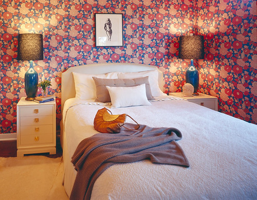
Today, I'm ecstatic about bringing you a peek into the life of the very talented Molly Luetkemeyer, of m. design. On top of that endeavor, Molly recently started her own blog (Molly Loot) which has already brought me a few pieces of inspiration. Her rooms are some of my all-time favorites and her use of color and pattern is brave, bold and extraordinary. After hearing her answers to some of our questions, I think I adore her even more!
Did you love design growing up?
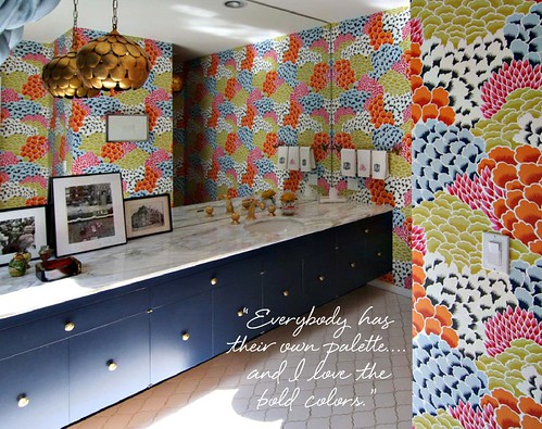
I think unconsciously I was drawn to design. My mother has a very strong design sense and worked with designers and one of my earliest memories is of the wallpaper sample book. She’d always ask what I liked and I’d flip to the darkest most lively color way --“What about the black with the hot pink and yellow?” I think I’ve always had this innate color sense. Everybody has their own palette - a comfort zone everyone has in mind - and I love the bold colors. I was unconscious of it but it was always happening.
One of my other favorite things growing up was my dollhouse—I redecorated it all the time. I’d pour over a catalog of little dollhouse pieces. The rooms would change constantly.
Was it hard to change careers?
I had an early midlife crisis. The irony is that I came to LA and thought I don’t want to work in film. I just had this moment of realizing I didn’t know what I wanted to do. I did some soul searching and friends said “Why don’t you consider interior design?” since I was always rearranging their houses when I’d go over.
So I signed up for classes and the first week I happened to meet Kelly Wearstler at a party. The stars aligned. So I walked up to her and said “What do you do?” and she said, “I’m an interior designer.” And I thought 'that’s really cool' so I said “Can I work for you?” and she told me to call the office. I worked as unpaid intern for three months for school credit. Then I stayed on for a year. It was the most incredible learning environment you can imagine.

Do you think your work would be different if you settled in a different city?
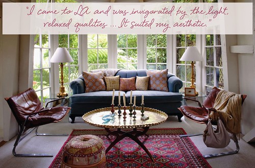
That’s a good question. Yes my career might have been different. [My style] might not have fit as well in New York, Chicago, D.C., or Baltimore. They have a more traditional look and more traditional color palette. I pull color from what is around me. The leitmotif going through this is that I’m very lucky. I came to LA and was very invigorated by the light, relaxed qualities of the space and it suited my aesthetic.
What are some of the most important or notable lessons you learned while working with Kelly Wearstler and Antonia Hutt?
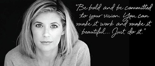
With Kelly, who is a colorist, it was to be bold and be committed to your vision. You can make it work and make it beautiful and then explain it after the fact to others. Just do it.
With Antonia, I’ve never worked with someone who had a better sense of interior architecture, how important things we take for granted are, like how adding fours inches to a doorway can make it feel really grand and sophisticated.
You use a lot of stripes and graphics on the walls. Any rules of thumb about that?
In general you have to look at any space from a place of balance and harmony. So let’s say we start with a bright red sofa, you have to think what’s going to work with that how do you help balance it? I do a lot of wall murals and they come out of a need to balance what else is happening in the space. When you work with strong color, stripes, and patterns, you have to balance it.
I had a teacher who had us pick at random six color chips which at first looked disgusting—but the exercise was to lay them in the appropriate positions so they look good. Once I started playing with them I realize a little of this color or that makes all of them come together. You find the balance and harmony. Sometimes I will bring in a color that doesn’t match at all and it works.
What is one piece of furniture or accessory people underuse?
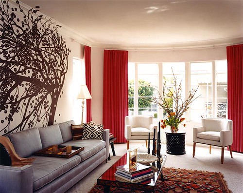
A standing lamp. A good standing lamp is your friend in pretty much every situation. It fills a dark corner - put a chair and table with the lamp and the corner is done. Pull one over a desk and you have another layer. They work whether the setting is traditional, modern, or cotemporary.
Also I’m a huge fan of ottomans. They are moveable furniture, great for kids, additional seating, and a tremendous opportunity to bring in pattern and color in a small dose
What is the biggest design mistake/blooper you’ve made?
A green room. I was working on a funny little space in the El Royale - it’s a fabulous building with great pre-war architecture and there was a little niche, maybe it used to be a porch that was enclosed, and we were going to make it a meditation space. The owners really like green and we didn’t test the color and just went ahead and painted and it looked like this radioactive vomit all over the walls. So all I could do was to say I’m sorry and repaint it. I learned always, always, always to put the colors up and look at them in the day, night, and to take your time picking colors.
If you could host a party anywhere where would it be, and what would it look like?
It would be in this Brancusi-filled studio in Paris that I was in before and all we would need to do is have a great bar and a great DJ. The aesthetics are taken care of.
What style/period are you most afraid of but would love to try your hand at?
Victorian. I’m afraid of true English antiques because I’m just not knowledgeable enough but I’d love to learn more and would be very interested to work with them.
If you had to spend $25, $250, and $2500 on 2 items respectively to make a big bang in a room, what would be they be?
For $25 bucks would be paint. I think you can do so much with paint and for $25 you could get a bunch of small samples pots and completely change the feeling of a room.
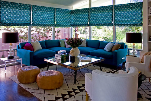
For $250 it would be lighting. Get some decent vintage lamps. I’d go to eBay where you can get something unique that no one else has and they can become the jewelry of your room. You can make a big change in your room with lamps.
For $2500 it would be a rug. Starting with a rug is a great idea. If you go with a pattern the rest of the room can be very simple. If the rug is dynamic and luxurious feeling, the rest of the furniture could be cream or white and it would be very chic.
What historical period are you most inspired by?
I’d have to say 50s and 60s in New York - it’s mostly the art, not the interiors - of that whole period with Motherwell, Sol Lewitt, Rothko, Helen Frankenthaler, the list can go on and on. That is the pinnacle of my sensibility, their palette, their depth, their balance.
Do you have a few favorite pieces, paint colors, etc that you continuously use in your designs, and why?
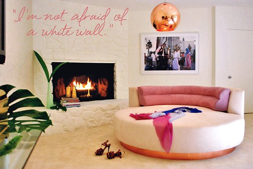
I’m not afraid of a white wall. I’ve had the pleasure to work with people who have great art collections and it is just the best way to display.
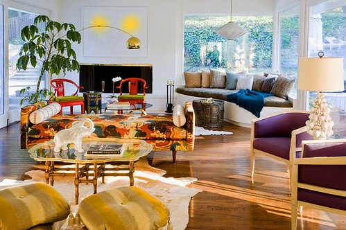
And I always use Lucite tables. I continue to return to Lucite in general but especially in tables because they can really work in a lot of different of spaces and with a mix, if you have a great rug they don’t obscure your view, they are good looking, and they are easy to shove in a closet and pull out for entertaining.
How often do you rearrange your own furniture/redecorate your space?
More than I’d like to admit. I use my space as a laboratory. It’s an opportunity to experiment with things I’d rather try out and learn in my own space.
What was the last piece you purchased for your home?
The last two things were a painting I bought in Palm Springs that is phenomenal and a dresser from an estate sale that is by this amazing rattan artist from the Philippines—it looks like it is made of ribbons of rattan and it’s in my bedroom and I get to look at it all the time.
Finish this sentence: No room is complete without…
The finishing touches and by that I mean the objects that are your personal, beloved items that make it your room. For me it’s art books - they are everywhere (it’s a little bit of a problem) but that’s what makes the room feel like it’s mine. Everybody has their thing.

What current trend do you most despise in decorating?
Dumbed down regency because it’s so ham-handed.
What’s the most surprising reward you’ve had from your career in design?
I’d have to say it’s Clean Sweep and the reward of knowing I’m actually helping people.
*Interview by Annie Lou Berman. Photography courtesy of m. design
