Showing posts sorted by relevance for query grey yellow. Sort by date Show all posts

Yellow & Grey

Mark my words people, grey is back... and right now I cannot get enough of the grey and yellow combo that I have been seeing everywhere... including in my bedroom!


Anthropologie is totally stocked with tons of home accessories in this color combination right now, including this fun chair, and a variety of pillows...


A little lighting with some grey and yellow?


Try this table lamp from EQ3. (It also comes in a pendant or floor lamp!)


A more subtle combination of the yellow and grey in a chandelier from Brocade.


I love this simple layered shade pendant from Lights Up! at Design Public.

Here are some new patterns from Marimekko for the Fall...


A room wouldn't be complete without some plush rugs from The Rug Company...


Chiesa Yellow


Durbar Hall by Designers Guild

And for the kitchen...


A cute hand towel from Patapri at Etsy.

Yellow & Grey Won't Go Away

It's been over a year... and as many times as I've seen this color combo, I'm still not quite sick of yellow & grey...


Love this bedroom via Cup of Jo (via Martha Stewart). I think my next thrift store find may have to be a chair like that to reupholster in golden yellow. (The best part? I already have the pillow!) And how creative is that photo wall? Love how they incorporated the color into it. The whole space is so warm and charming... a girl can't help but fall in love.


Pulling it Together

I love when I see something in a store and suddenly ~ click! It all comes together. I've been wanting to create a more soothing look in my bedroom, but hadn't found any inspiration. Then, the other day I was browsing through Anthropologie when this pillow caught my eye...


The second I saw these colors I was sold! Right now I'm absolutely loving the grey/yellow combo, and adding a splash of green in there made it perfect. If you look closely you'll also see that the lighter grey has a hint of blue in it, and the darker a bit of plum, so I will be pulling in little doses of those colors too, I'm sure.

Now, time to build a little inspiration board!

I found this bedroom at Commune and was totally inspired again. A little dose of red? I can do that!


I've always loved tea tables, and have seen them a few places, but just yesterday found these ones on sale at the Company Store when I was searching for comforters. Only $39.99 on sale. Such a deal!


The sheets I have already match the gold tone in the pillow, so now I'm looking for an interesting charcoal bedspread. Of course my first stop was to check out some Dwell bedding at Design Public and, as never fails, I found some great options.


These colors are perfect! The charcoal or the blue would work. In fact, the whole collection is kind of what I was looking for. While I'm not too big on stripes, I think a few pillows would be fun..


Love the cabana-esque feel!

Ok, I've got a good start, now I'm going to scour for accessories! Stay tuned!

How To Make An Entrance

While this is still my current favorite entryway, I think every type of space deserves a little drama, which is why this week's inspiration pick is this colorful entry from Living Etc.


Perfect for a clean cool beach house, don't you think? And why limit this idea to just one color? How great would it look in shades of yellow? Or gradations of orange, pink and red? I'm also lovin' that wood stool (not so much the crazy magazine rack thingy).


I also just stumbled upon this entryway via Studio Annetta, and LOVE it. For obvious reasons (grey and yellow), and because that dramatic chandelier makes an incredible statement. Not to mention the depth and detail in the subtle grey and white paint, with barely there black trim is so elegant. Also, how cute is that little bar cart behind the sofa?


While I can't quite tell if this little nook is part of an entry or not, I think the styling is so perfect, I had to share. There's always those awkward spaces in a home that are tough to conquer, and Brad Ford does an especially good job of creating a clean and simple area that stands on its own... and allows that intricate railing to take center stage!

Of course, you can make a dramatic entrance anywhere in your home as evidenced here...


The Brondesbury Villas are a popular destination for inspiration, and this entry leads into a sunlit conservatory. Anyone can do double doors, but add a bit of black billowy drapes, and voila! Drama.


And, if you're very very VIP, you should definitely have an entry to your bedroom that looks like this. It's like the ladies way of saying, "That's where all the magic happens, darling!" (Yes, mom, I really did just write that.) Plus, I have a thing for natural colored linen - it feels so very Italian... yum. (Via UXUS Design).


Primary Palettes

While I don't think many of us would run to decorate any space in primary colors, when your basic red, yellow and blue take on different shades, the color combo can become surprisingly sophisticated...
I have always loved this shot of Keira Knightley from one of my favorite editorials (and I'm not really a huge fan of hers) because I adore the mix of styles here - preppy safari meets bohemian is how I suppose I'd summarize it, which is exactly how this room via House Beautiful comes across to me. Refined, but worldy (and perhaps a tad overwhelming? I'll let you be the judge). It got me thinking about how I'd recreate this palette in my own home - starting with that pillow from Koko Company. A shade of blue that looks more grey, a golden mustard yellow and a more coral tone of red. Then I stumbled upon this photo in my archives and thought - now that combo has serious potential. Again a more retro golden shade of yellow, a pure bright red, and a gorgeous teal blue. Anchored by black and beige, it's a winning palette - and almost perfectly represented in this room via Canadian House & Home - all it needs is a touch of the blue! Rich and intense, the amount of beige (and light!) in this room keeps the palette from becoming too heavy.

Fall RTW - Trends

For those of you who have been following my blog for a while now, you already know how much I feel that fashion and interior design influence each other. So, you can probably guess what I was doing all last week...


(Red gown by Marchesa, Red room via Desire to Inspire)


That's right, friends. It was Fall RTW Fashion Week! So, here I am ready to give you the best of the best (in my most humble opinion). Instead of doing a daily update on my favorites like I did for the Spring RTW shows, however, I decided to wait and do a few posts after seeing all the collections.

Today, we'll talk trends. The good: metallics, fur, blacks and neutrals with pops of serious color, plaids, gloves, cinched waists, adorable hats and other toppers, and many more. The bad: Trends circa 1990 - boxy cuts for suits and jackets that look horrible on everyone, grungy influences like bad plaid, clunky chunky boots, pasty pasty models, and more pieces that made me wonder if some of these designers had been spending too much time in Seattle... (don't get me wrong, I love that city dearly, but a fashion capitol it is not).

So, we'll leave out the bad, and stick with the good. There's only so much room, after all... (PS ~ My apologies for the small groups of photos, but if you click on them, they will get bigger so you can see the detail on these gorgeous pieces!)

Fur!


Faux or real, it was everywhere on the runway. Fur coats, trims on dresses, vests, hats, lining, you name it. These were a few of my favorite ensembles including fur. From left to right... Dennis Basso with a dreamy creamy look, Malandrino cinched up her grey to give it shape and paired with with silver pants for a classy look, loved the off-the-shoulder fur in all black from Douglas Hannant, a cute combo of textures and shapes from Malo incorporating a fur vest (lots of great fur and designs in this collection), and another jacked from Malandrino that might be in the yummiest warm taupe color ever.


I also fell in LOVE with these two designs from Matthew Williamson who used a lot of color in his collection. The texture in the grey and seafom colored dress is especially gorgeous.


Black & White:
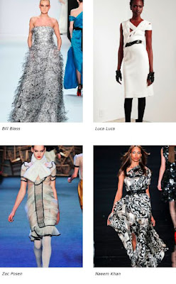


Lots and lots of black on the runway this season. Black and grey, black and white, black and black... but these pieces were the ones that really popped on the runway for me. A feathery concoction from Bill Blass, gorgeous construction from Luca Luca, Zac Posen doing what he does best with ruffles and texture, and a flowy ikat-printed dress from Naeem Khan.

Menswear Fabrics


I don't know if we can really classify this one as a trend, but I love the mix of menswear fabrics - herringbone and plaids - in these pieces. From left to right: a simple look from Abaete, a slouchy suited mix from DVF, a crisp button-up from Lacoste accented with a bold scarf, a cozy herringbone dress from Malo, a mix of plaids from Peter Som looks adorable with a bit of ruffle at the bottom, and a funky mix from Thakoon is topped of with a punch of yellow.

Metallics


Yes, they're still here. Metallics aren't leaving anytime soon, and there was an abundance of them on the runway from the brightest silvers to the addition of deep coppers, and everything in between. From left to right: A sassy little dress from Preen, a deco inspired sequined dress from Douglas Hannant, a pop of sequins in a slouchy 'suit' ensemble from Lela Rose, another Douglas Hannant piece in a striking silver, a Badgley Mischka stunner, and a lovely flowing dress from Michael Kors.


And there's more! Gorgeous gold squares from Brian Reyes, a simply structured piece from Derek Lam, one of my favorites from Oscar de la Renta, a unique flowy button-up dress from Isaac Mizrahi, a deep copper from J. Mendel, and finally, a pop of copper from Brian Reyes.

Plaids


The truth about plaid is that its a fine line for me between well done, over done, and just plain trashy. So many designers incorporated plaid into their collections that you'll see it in all of my selections, but this piece from Carolina Herrera was probably my favorite. So, today I leave you with that bit of inspiration. More tomorrow!

Just When You Thought You Were Over It...

The killer color combo grey + yellow strikes again!

Completed by the shimmer of sequins! Ok, I'm completely in love. I might have to purchase... right here.


Crowning the Color Of the Year!

Envelope please? Thank you.

Ok, honestly, you all should know the winner if you were following the last week at all. Will you all please give a round of applause to the reigning Miss Color of the Year 2009...

Miss Pink!

While some of the shades varied from apricot and peach tones to seriously bubblegum and bright fuschia, there is no doubt the winner for Color of the Year 2009 is the barely there blush of soft warm pink.

While Pantone's yellow makes sense for a year where we need a little positivity and color, there's something comforting about pink that's getting the job done just as well. My pick for this shade would be a bit more on the peachy side, for extra warmth and a more neutral tone. So soft and comforting... Miss Pink, welcome to your reigning year!

And, of course... we can't forget the runners up...

Second place was a bit of a surprise to me. While we couldn't agree on a shade, all of us but one panelist selected some shade of blue for 2009. While I think the electric blues will fade, the indigos and pastels will grow in popularity. And, City Sage was so right on with her 'denim' prediction. Translating your most perfectly worn soft pair of jeans into a comfy color to decorate with (not decorating with actual denim, thank you very much) is so genius.

I bet you all thought Miss. Grey was surely a shoo-in for runner up if not winner of the whole thing, huh? Well, don't worry. I think this color is going to stick around longer than blue (it is the new black, after all), but she just couldn't win it all in a year that needs a shade with a little more warmth. Come to think of it, I'm wondering if neutrals ever win color of the year?

And, in case you were curious, the 'Neutrals' were next in line, followed by Green, Red and Yellow. My biggest shocker? Nobody mentioned Orange. Although, I suppose that peach and apricot tones count a bit.

Here is my own final palette...

coco kelley 2009 picks

These colors are my top picks for the year! The only addition I might make is a dose of deep aubergine. But, I'm just not much of a purple girl. And, if I had to pick a yellow? More on the mustard side I think. The top four are the dominant colors with the bottom three as accents to each season.

I hope you all enjoyed this little color week series! Thanks again to all the guest bloggers, and I hope to have this much inspiration around here all year long!

Color Predictions from The City Sage

Yes, I know. There already is a 'color of the year'. And, while I will never tire of mimosas admit it... aren't you just a teeeeensy bit sick of seeing yellow absolutely everywhere? So (with all due respect Pantone) we're selecting our own color for 2009. That's right, we.

While I'd like to think I'm pretty good at spotting trends, crowning a color is a lot of pressure. Therefore, I've put together a very official little 'panel' of some of my most favorite style-savvy bloggers to help me out this week with their own color predictions, and by the end of the week the tiara will be passed. (Yes, it's like Ms. America. Except cooler.)

Kicking things off is Anne from The City Sage (which -btw - might just be my current fave blog), with her top four nominees and predictions for the best colors of 2009!

lace trim

Denim Days: Denim is a wardrobe workhorse, so why not give it more attention in home décor? I'm not talking suburban rec rooms with their overstuffed denim sofas. Think surface treatments inspired by the washed out blue of your favourite jeans, textiles offering the quiet luxury that only a pair of perfectly worn 501's can provide. Imagine sky-high curtains that pool indulgently to the floor—made not of silk but of the palest chambray.

Row One: Ewa-Marie Rundquist, Ditte Isager Row Two: Warren Smith, Finola Inger

Baby Pink Grows Up: Forget about bubble gum, cotton candy, and the countless other iterations that have earned pink its saccharine reputation. Instead, seek out a true, barely there pink—one that has no peach, lilac or rose undertones. Then make it modern by sticking with bold graphic lines and by creating unexpected color pairings. The new pink is cool, effortless, and a wee bit cheeky.

Row One: Domino Magazine, Thuss Farrell Row Two: Elle Decoration October 2008, Domino Magazine

The Carbon Cycle: Grey has gained popularity in recent years and is still going strong. For a fresh take, explore the darker side of this perennial favourite: earthy shades like coal, graphite and gunmetal provide a dramatic foil to the ubiquitous calm of French and flannel grey. Test the waters with an antique camelback sofa upholstered in a rough, almost-but-not-quite-black linen. Or go all the way and paint your walls a deep graphite.

Row One: Elle Decoration October 2008, Elle Decoration September 2008 Row Two: Christine Rudolph, Katya de Grunwald

Lime Pop: Even when dining by myself, I use a wedge of lime to garnish my drink—that little kick of color and vibrant flavour invigorates even a humble glass of water. So imagine what it can do around the house! From the punch of a green lamp to the pow of a single green teacup in your cabinet, lime is like a tropical vacation for your eyes. Team it up with various neutrals; I like it equally as well with warm woods as I do with crisp whites and even—you guessed it—charcoal grey!

Row One: Gaelle Le Boulicaut, John Paul Urizar Row Two: Elle Decoration December 2008, David Shields

lace trim bottom

A huge thanks to you, Anne! I'm loving your choices, and a few are similar to my own (pink pink, hint hint). And, of course, love the green. (I never knew I needed green socks to lounge around in, but consider it done.) Can't wait to see what my other guest bloggers come up with! Stay tuned my dears!!

The Inaugural Fashion Frenzy Wrapup

I'm just going to go ahead and say it now...

Aretha's hat stole the show. I mean, DAMN. That is a HAT! But it was perfect. The grey would have been so boring, but the bow! The sparkle! I mean, she had to have something to match that voice, right? And I loved the vintage stylings of it all. Fabulous, Ms. Franklin. Well done. Now as for the other ladies...

Let's start with what is hands down my favorite photo:

The Obama women were dressed in beautiful refreshing color. Look at these little trend watchers! We've got royal blue, pink and orange, and of course the color of the year - yellow - on Michelle. LACE yellow, no less. Double bonus points. The only piece I really didn't like was the choice of green gloves and shoes. I would have gone black or metallic.

And then there's our adorable President. (When was the last time you used 'adorable' and 'president' in the same sentence?) He kept it simple just as he should. The only accessory that man needs is his smile.

Let's not forget the Second Lady (is that a real term, or did I just make it up, because either way I'm sticking with it)...

I think Jill likes red... I also think she's the cutest thing ever and looks fantastic in that color, so good for her. Jill, I want your ruffly little coat. We look about the same size. Whaddaya say? (I'd settle for the gown too...). Another hit for the new administration. Oh, and Joe, just keep rockin' that tan. You'll be fine.

And then there was the gown we were ALL waiting for...

OBAMA/

So... what did you think? I liked it. I didn't LOVE it. I didn't gasp when she walked out, but I liked the choice of white, actually. And the dress itself is definitely stunning, as is this couple. I mean, just look at them! Ok, look at the details...

Michelle was definitely sparkling too. The only little thing I just really have to say is this: Michelle, you are a strong, gorgeous woman, and you're missing the one little step it takes to pull of any outfit. So, throw your shoulders back and stand up tall and straight! We love you!

Color Predictions from Snippet & Ink

Outside of interiors and runways, wedding color palettes are one of the first places we see trends emerge. Savvy brides and planners do their best to pounce on the most original colors before everyone else is doing them, which is why I invited our next guest blogger to join in on helping to crown the Color of the Year.

I'm so happy to have Kathryn from Snippet & Ink here to give her predictions for this year's hottest color combinations! She is simply amazing at putting together her inspiration boards, and sees so many shades and hues come through her site, that I knew she'd have some fabulous ideas for us... and indeed I am truly impressed (and in LOVE) with her palettes!

lace trim

Turn up the dial on yellow to give this this typically nautical/preppy combination a modern, bold look. A little fuchsia thrown in doesn't hurt either.

These two together (or apart) are a nice twist on the all too obvious, and overly-saccharine, pink and green. Cream keeps them balanced.

I imagine gray will still be popular this year, but I'm predicting a move toward warmer neutrals. Colors reminiscent of an old city bistro...

{L: Ellen Christine from Brides R: Miriam Haskell via This is Glamorous}


Softly romantic and impossibly sexy, these two colors play off one another beautifully.


lace trim bottom

Every one of these color combinations is speaking to me! Kathryn, you've done an amazing job. The yellow and blue is so fresh, and has recently started growing on me (Marc Jacob's Spring collection, anyone?), and the red and peach... so feminine and vintage. I also agree that while I adore grey, warmer neutrals are starting to be a bit more appealing to me. By the way, darlings, for full inspiration boards of each of these color combos, just click on the headers for each!