Cheers to a Long Weekend!
Enjoy yourselves! With three whole days to catch up on things, I'll be back Tuesday with some great posts!
(Room by Joe Nye)
Room of the Week 8.30
My best friend just got back from a business trip in London raving about the UK magazine Livingetc, and I realized that while I have visited their site a few times, I had never taken a good look at their galleries.
While most of the images were a bit... well... plain, a few rooms definitely stood out, and this one was my favorite from the dining room gallery. I love how they chose to use minimal pieces with glass and lucite to allow for the gorgeous gardens to be the focal point. Adding the yellow acrylic shelving makes it much more interesting too! What a cool concept.
Labels:
acrylic,
room of the week
Cleaning House
Whew! I just updated my blog lists ~ there are so many great places for inspiration that I wanted to do a little more organizing, so I now have my favorite design blogs on one list, and miscellaneous blogs on the other... hope you enjoy!
(Image via Getty Images)
More Aqua...
Apparently I'm on an aqua kick...
I bought these deep plum colored dahlias last week and put them in my aqua glassybaby because I didn't have the right vase... and I am totally loving the color combo. Then, I found this vintage handkerchief on ebay and got into a little bidding war for it (I lost).
But I did find some more inspiring images for your viewing pleasure! This is definitely a way to bring aqua into the fall color palette...
(Top image via decor8, bottom left via Domino, bottom right via Skona Hem.)
Labels:
color trends
Rooms from the Runway
Once again, I return to the runway for inspiration. I loved these two pieces from Balenciaga's Fall 2007 Ready to Wear Collection ~ probably because they allow to me incorporate that little pop of aqua that I've been decorating with for so long (and am ready to phase out... a little).
This is an incredibly eclectic look. The layers of fabric make it bring a bohemian vibe while the bold black and white pattern almost looks a bit tribal. The gold details, however, add a deco glam that was so popular in fall collections. A touch of fringe and the lace up boot lends to a more classic look, and the pop of aqua is totally unexpected. Just imagine what this room could look like...
Let's start with the couch ~ I picture something in a deep caramel in a luxurious fabric like velvet or mohair... something like this piece from Jayson Home & Garden with a simple but classic shape.
To bring in the black and white, I'd choose some accent chairs with strong shapes like this one from Barbara Barry...
... or the Sam Chair from Oly
Maybe an accent bench in a classic deco design on the other side...?
This one is a Karl Springer design I found on 1stdibs.
To complete the room, we need the pop of aqua... and I think I'll do it in the rug!
Don't hate me, but I'm completely in love with this piece I also found on 1stdibs. It might remind you of you mother's (or grandmother's) disgusting shag carpet, but I think it has really great organic texture...
And of course, to top it off, a large coffee table - I was picturing a solid piece of burlwood, but found this piece (also on 1stdibs - forgive me!) that had a touch of gold and thought it might be just perfect...
Pull these pieces together with some accessories, and look what we've got!
(Lamps from 1stdibs, pillow from Sleeping Buddha)
(Pillows from Madeline Weinrib, lamps from 1stdibs, variety of vases from Jayson Home & Garden, bowl by Caleb Siemon.)
Labels:
color trends,
gold,
pillows,
rooms from the runway
Light Up Your Nights
The days may be getting shorter and shorter, but here in LA we're still enjoying our evenings outdoors... we just need a little help lighting up our nights! The creative minds at Generate have been providing inventive and artistic lighting options for years, and I still think their collection is one of the best.
These glowing pots are a beautiful contrast to simple organic design. I can see them lining a walkway or pool, in clusters on a patio, scattered throughout a garden, or just one lighting up your front porch to welcome visitors.
The Sun Jar is a great way to think green. Completely solar powered, you can keep these jars outside or on the windowsill during the day so you can enjoy them all night.
The Luau Lamp is another stroke of genius. It can be lit while charging and used anywhere, but the best part is its portability. The lantern automatically lights up when picked up, and has different levels of lighting to conserve the charge.
Of course, Generate also offers some other incredibly cool lighting pieces as well... it's really more like art than any lighting I've ever seen. They have chairs, tables, shelving and more that all glow, as well as gorgeous wall and pendant lighting. This is still one of my all-time favorites... (and it's affordable too!).
It absolutely glows when it's all lit up, showing off the incredibly simple yet stunning honeycomb pattern created by the paper.
Labels:
Lighting
Avocado - Hot or Not?
Ok, I may be losing my mind. Or I may be getting one step closer to Kelly Wearstler genius status. I found these avocado green horses with bright white manes on ebay and cannot stop staring at them!
Placed in the right setting, would they look incredibly perfect or horribly kitschy? Picture them on a white lacquered credenza, framed by gorgeous vintage lamps, black walls, oversized chandeliers... I start to think they have potential! Then I think... ok, buuuuut... they're avocado green. Really?
What do you think?
Labels:
i love...,
thrift finds
Get Yourself Some Beach This Weekend!
Enjoy the last few days of summer while you can, my friends!
Image via RougeRouge on Flickr - one of my favorite photographers!
Lovely Deliciousness
Who wouldn't want to shop at a store that uses descriptions such as wonky, cozy and deliciousness to describe their goods? Vessels & Wares on Etsy features some seriously cute pottery pieces, including my favorite "Scalloped Grey Lovely" below.
So sweet! In fact, all the "lovelies" are adorable. So is this simple "Blue Wonky Bottle Set."
Or a warm "Caramel-ly Bowl"
I always think it's nice to have a few handmade pieces around the home... it seems to add a more personal touch, and knowing that each piece is unique makes them a bit more special :)
Labels:
gifts
Room of the Week 8.23
If you saw this room empty it might look like a bad swiss chalet nightmare... but a basic color scheme, some retro style, and keeping it simple give this little attic room a whole new, laid back style.... what do you think? Is it working?
Labels:
room of the week
Branch Out
Some of you may be familiar with the website Branch where they promote sustainable design in the coolest forms. Looking through the site yesterday I found a bunch of new pieces. Isn't it wonderful how easy it's becoming to support design that is friendly to the environment?
I love these little guys! (Hmm... perhaps because they're grey and yellow?) The Mason designed by Amy Adams handmade are handmade in low-fire ceramic with a non-toxic glaze, which makes them more environmentally friendly to create. Plus, don't they just want to make you pick a bunch of wildflowers and display them on your windowsill?
I know what you're thinking... not another tote!! But this one is so cool, I had to post it. The AUM tote created by Red Flag Design in Vancouver, Canada is made from reclaimed sailcloth and retains its nautical heritage with a knotted handle and sturdy reinforced grommets. Just think ~ this bag has possibly seen more of the world than you! And imagine how long it will last when you take it on your own little boating adventures.
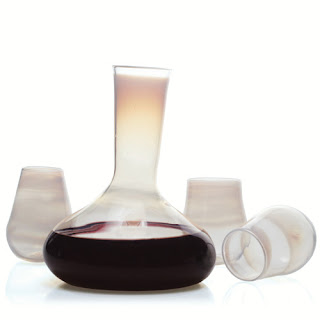
As someone who adores stemless wine glasses (mostly because I'm less likely to knock them over!) and has been searching for a nice decanter, I especially love this item. Handmade by Esque out of Portland, OR, this set is about as earth-friendly as you can get. The decanter and glasses are made from recycled glass stock processed in an electric furnace that's powered by wind energy. Cheers to that!
I wish I could test this chair out for the comfort factor because not only is it made from wood sustainably forested in New York and Pennsylvania, but it comes in a grey lacquer which is just what I've been wanting! They are sold in pairs, and offered in a variety of finishes.
Labels:
sustainable design,
tabletop
A Moment in Time
As if House&Garden didn't already provide enough inspiration for us home decor addicts, they are now offering prints of photographs from their archives that are absolutely stunning! To browse the collection click here.
Because of their age the coloring and settings take on a surreal quality that is soothing and captivating at the same time...
...not to mention the historical aspect of the photos themselves...
... and of course the pure genius of the composition that H&G photography always exhibits.
Because of their age the coloring and settings take on a surreal quality that is soothing and captivating at the same time...
...not to mention the historical aspect of the photos themselves...
... and of course the pure genius of the composition that H&G photography always exhibits.
On a Different Note...
I haven't posted much on my blog on stationery, but when I received this invitation in the mail from a dear friend of mine, I had to share it.
I love so many things about this design! The wedding is in Montana, and I feel like the edges and old fashioned lettering of the invitation and envelope give it a "western" feel without being kitchy. The deep, rich colors made it quite classic, while the decorative floral imprints added a bit of whimsy and romance. It's a great balance of masculine and feminine... imagine that! An invitation that appeals to both sexes!
My absolute favorite piece of the invitation, however, is the personalized monogram on the cover of the rich black (or is it a really dark brown?) envelope.
What's wonderful is that this is a design that the couple (Isabell and Mark) will be able to use for years to come.
Oh, and in case you're wondering, the invitation was created by Limb Design ~ a company out of Houston, TX that Mark and I discovered years ago and who have since become good friends of his. As you can see, they have an incredible talent!
Labels:
paper
Skona hem!
Perhaps I'm the last person on earth to have discovered this, but the Stockholm based home magazine Skona hem has issues posted online for your pursuing pleasure. It's so fun to see resources and designs from Europe (I regularly try to pick up Vogue Living Australia as well ~ it's available in the States at bookstores, and I highly recommend it!)
Here are some of my favorite images...
I'm really attracted to this deep purple right now, and I love the idea of using the area above the stove for a simple display.
This has such a fun tiki vibe to it! A great bar set up. I especially like the fabric on the stools and the use of color.
A fantastic black and white room!
Any other international magazines worth hunting down? I'd love more recommendations!
Labels:
rooms
Top Three: Still Crazy After All These Years
I was going through some old issues of Domino last weekend, and came across these bowls by designer Hanna Ljungstrom that I had noted for their great color. I love them just as much now as I did back then! Which got me thinking... there are quite a few pieces that are still just as hot today as they were when they first arrived on the scene a few years ago (those Wallpaper bowls were designed in 2001!) so these are the top three:
Maybe it's just me, but I still go crazy for the "Delight" pattern by French Bull that has been around for at least four years. The black and white with pops of bright colors always come out of my cupboards in the summer!
The Mademoiselle chair from Phillipe Starck was first designed in 2003. This pattern was created in 2005, and is by far my favorite.
Labels:
tabletop
coco+kelley is on Etsy!
Since my days off generally consist of digging through thrift stores, craigslist, flea markets and more, I've decided to start a store on Etsy offering up some of the best and most original pieces I come by! I hope to have a variety of styles, a little something for every type of home and person... but for now it's a very small selection! I'll be adding more soon, so please check the link on my blog from time to time. And if there's something you're looking for, let me know! I just might be able to find it :)
Here's what I've got so far...
These two needlepoint pillows have a Jonathan Adler quality that makes them pop! I really just loved the combination of such a retro color scheme with the honeycomb and lattice patterns ~ it's a great mesh of old and new.
I couldn't pass up this cute little dish! It's one of my addictions. I have little jewelry trays all over my apartment. The graphic pink tree was just too awesome.
Room of the Week 8.17
It takes guts to use this much color in a room ~ and in solid pieces no less! The bold yellow and aqua walls, with a strong red couch? Mismatched chairs? I'll admit, this is not a style I'm always comfortable with using myself, but I know when it's done well, and for such a small space to contain so many strong pieces and somehow manage to keep a flow ~ it's really amazing. Plus, I have to say that I'm in love with the rug. Anyone know where to find it?
Labels:
room of the week
Tag... You're It!
Julie at Belle Vivir just tagged me, so apparently I'm it! I am supposed to say 7 random things about myself and tag 7 more fellow bloggers, so here it goes...
1) I am HORRIBLE with numbers. I don't know when this happened, but apparently being a very visual person makes me terrible with math.
2) My dad was born in Italy, which makes me a first generation American on his side of the family ~ so strange to think about! He owns a restaurant in Seattle that has the best meatballs and red sauce you've ever had.
3) I love leaves crunching in the Fall. It might be one of my most favorite simple things, and it turns me into a 7-year-old.
4) I'm a total neat freak, except for when it comes to the clothes all over my room. Cleaning is like a form of therapy for me!
5. I started blogging because I feel like we should all experience something new and inspirational every day. When I'm driving around the city, I try to stop and notice the things that we either don't see or take for granted. I love to travel for the same inspirational reasons ~ seeing new places is completely energizing!! (that was like two things in one)
6. You'd think that a home decor addict would love HGTV more than anything, but actually I prefer ESPN over pretty much everything else on TV. They have the best commercials! And you can't beat Sportscenter one-liners.
7. When I was little I used to practice being Scarlett O'Hara in the mirror ~ I thought Gone With the Wind was the most romantic movie ever!
I'm still figuring out who to tag next...
A Touch of Trim
A wonderful way to add a pop to your room without painting an entire wall is to highlight or create architectural details with a complimentary color.
If you're going for a black and white (or even neutral) theme, adding a bold color like in this room designed by Woodson and Rummerfield could be just what you need to add some interest! Think about how great an orange would look with a taupe wall in a very natural organic room. Or a bright teal to match an all white beachy look.
You can also use trim to pull out colors in the room that might go unnoticed. See how the blue trim on the door really pulls out the blue in the wallpaper? It really creates a continuity in the room without distracting from the overall design. It also makes pieces like the pillow on the chair work even better because the blue ties it all in.
Labels:
decor trends,
rooms
Subscribe to:
Posts (Atom)