 The stunning entryway. Let's count how many things I love... 1) the high back bench in seriously great fabric, 2) the entryway piece (because with an area this small you wouldn't normally think to use a piece right in the middle, but it works!), and 3) the tile on the stairs. I think that's good for starters...
 The eclectic living room. Love the windows, love the couch, love the bench, love the chairs... love it all. Next!
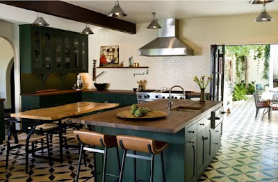
 The kitchen. Hrm. Almost a little too country/Scandanavian for my taste, but I am digging on the subway tiles, the dining table and chairs, and the stools. Doesn't the tile look kinda like my header? I guess that makes it cool...
 But this might be the best part. The tile leads out to an a.maz.ing outdoor dining space. I love the freshness of it! The simple landscaping with lots of green green green, the tall walls, the very mid-century style fireplace (complete with sweet seating), and the fountain. Even the grill is awesome. I'll take it!!
 A cozy little living area. Very cool couch, and I love the ottoman and how it picks up on the yellow. Wouldn't be complete with out a custom upholstered (probably vintage) Eames lounger!
  The bedroom. Hm. There are pieces here I don't really love, and it feels a bit like I'm staying in a log cabin resort trying to make things chic. I'd keep the headboard and the curtains, and chop the rug in half. The rest needs to be a bit more glamorous to make it less country for me (can we please get rid of the fringy fringe on the bedspread?) Still, I respect the design they were going for.
 Soooo... whatcha think dear darling readers? Which room is your fave?


