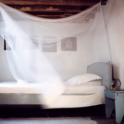
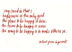
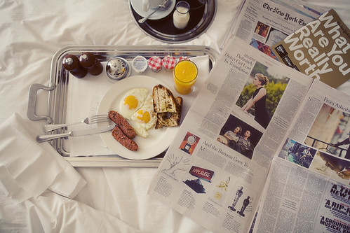
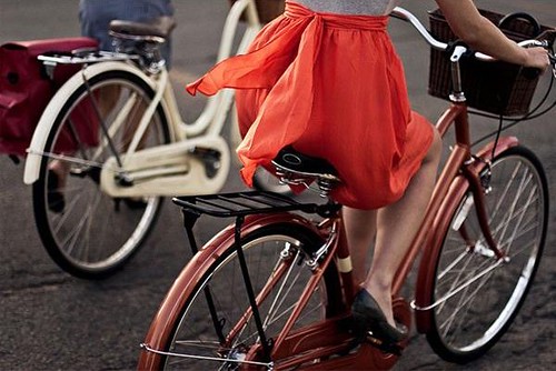
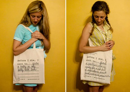
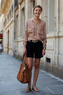
Bastille Day has come & gone and the Tour de France has cycled through to Paris until next year', but there is absolutely no reason that we all can't keep celebrating our inner French girl!
I've slipped on my Bensimons (one cannot have enough of these cute little canvas numbers!) and queued up my Coeur De Pirate album (love!) to put myself in a French frame of mind, which wouldn't be even close to complete without clinking glasses filled to the brim with a take on the classic French aperitif, the Blackberry Kir.
The Blackberry Champagne Cocktail:
4 blackberries, quartered
1/4 cup Triple Sec
4 sugar cubes
Angostura bitters as needed
1 bottle Champagne, Prosecco or other dry sparkling white wine, chilled
In a small nonreactive bowl, combine the blackberries and triple sec and let stand for 15 minutes to let the fruit macerate. Place 1 sugar cube in each of 4 Champagne flutes and add 1-2 dashes of bitters to each. Spoon 4 pieces of marinated blackberry into each flute. Top with Champagne & serve immediately. Serves 4.
* images via the food channel, iTunes, & we heart it
Paris Hilton Long Blonde Hairstyles For Curly Hair
Paris Hilton certainly knows how to make heads turn. Most recently, she earned a features spot in Nylon magazine. This gave the star the chance to show off her most recent hairstyle. Hilton is yet another star in the line of celebrities choosing hair extensions to create their look. Her most recently spotted ‘dos are a result of her endorsement of a new line of temporary hair extensions.
Paris Hilton Long Blonde Hairstyles
For Curly Hair
For Curly Hair
Thus, the star can go from short to long and anywhere in between on a moment’s notice. This may seem like an admirably versatile hairstyle. However, Hilton has been criticized for the obvious fakeness of her ‘do. Her looks are seemingly flawless, too flawless. Not a strand is out of place and there is almost no natural movement to her styles. Hilton’s color also adds to this doll-like image.
Paris Hilton 2008 winter Long
Blonde Hairstyles
Blonde Hairstyles
Her newest shade of choice is a very yellow blonde with minimal highlights. The lack of extra tones limits the dimensions of Hilton’s look. However, for the many fans who crave her style, this artificial perfection may be appealing. After all, many women crave a style where each strand is in its place and retains the perfect blonde color. However, it would be nice to see a little more personality and life from Hilton, who is setting herself up to be viewed as an artificial personality.
Happy {Mid-Summer Night's Dream} Weekend
My loves, it's finally Friday. Breathe a sigh of relief.
photos via automatism, everything fabulous and bonnie tsang
I don't know about you, but I'm so ready for a slow, luxuriously lazy weekend. I hope you get to lay back and enjoy it too.
Till next week luvies,
*Mrs E
photos via automatism, everything fabulous and bonnie tsang
I don't know about you, but I'm so ready for a slow, luxuriously lazy weekend. I hope you get to lay back and enjoy it too.
Till next week luvies,
*Mrs E
Labels:
photography,
weekend
HAPPY (DIVE RIGHT IN) WEEKEND
This weekend I'm plunging headfirst into apartment hunting as well as a few big projects... a few of which I actually hope to complete!
While I'm doing that, I hope you'll plunge into my July sponsors websites. If you haven't visited them, now is a good time because we'll be saying goodbye to them in August! Speaking of which - there are a few sponsor spots left for grabs so spread the word. We love adding new partners to coco+kelley!
A big thanks to the lovely shops at The New Traditionalists and Saffron Marigold, beautiful bloggers Sage & Style and Ada & Darcy, my friend and lifestyle expert Kelley Moore, and wedding resource extraordinaire, and Project Wedding for being Premiere Sponsors this month! We were also happy to welcome A Fashionable Life (who is offering readers 20% off with code: cocok), Blue Hour Designs, Clayton Gray Home, Ruby Plaza and Max & Chloe as supporting sponsors as well.
And thank you readers for supporting us this month as we launched our first contributor posts! We can't wait to add more to the mix in August. Have a fabulous weekend all!
xo,
cassandra
Labels:
weekend
I've Got A Crush
On being brave enough to bike in a skirt,
On design in bag that turns out this looking this good,
on fanciful fashion,
On fall boots and bags,
On totes for a cause,
and on the amazing work of my blog friends. Thanks again Lovely Clusters!
On design in bag that turns out this looking this good,
on fanciful fashion,
On fall boots and bags,
On totes for a cause,
and on the amazing work of my blog friends. Thanks again Lovely Clusters!
Labels:
i've got a crush
STRIPED STYLE GIVEAWAY: CABBAGES & ROSES
When I was a little girl, I had two requirements when it came to dresses. They had to pouf and they had to twirl...
Something that wouldn't be a problem in this fun skirt from Cabbages & Roses! And I have to say the philosophy translates well to my style of curtains too - billowy and flowy. But it's not just the style of these pieces that initially sparked my interest in this company - it's actually their latest book featuring the impeccable designs of founder Christina Strutt.
At Home With Country features the very classic style of Cabbages & Roses in every type of home - from city apartment to rural farmhouse - showing exactly how these vintage textiles can work in any environment. I was lucky enough to catch up with Christina and ask her a bit more about her inspirations for one of my favorite topics - the crossover from fashion to home design!
What is your process for creating the C&R design collections?
The first thing I do is panic - as I am always late. Second, I visit Paris fabric collections. Hopefully I will have had some inspiration during the few days before, but as we are always so busy, the inspiration (if I am lucky) comes on the Eurostar train to Paris. I expect normal designers have thought vaguely of what their collection will be about a long time before fabric buying. I am never this organized. For the next collection though, I might just go abroad for a few days of concentrated work without e-mail and without telephone - it is these two distractions (and my addiction to them) that prevents creative flow!
We depend on finding most of our clothing fabrics in Paris. I am drawn to fabrics that I think nobody else will use - unfortunately the criteria for uniqueness is expense. I believe, though, that there is no point in creating anything that looks ordinary as it is perfectly possible to buy 'ordinary' in a million places at half the cost.
Six months later the collections miraculously come together and they have found a theme of their own. Last winter it became Atonement (the film), without me realizing until we were at photography stage. This summer the stripes kept appearing and it turned itself into a French themed collection.
Which comes first the fashion or the home line? Or do you design them separately?
They are usually designed quite separately, but we are trying very hard to coordinate the timing – which is proving quite difficult as the production of home and fashion fabrics are out of sync and it will take a while to make them work together.
I always have a dilemma as to whether to use our home fabric designs in fashion, but my fear is that people might feel a little 'Von Trapp-ish' - as in The Sound of Music. I, however, have never minded about dressing like curtains - I think it is a charming way to dress! We are working on a new collection, which I think would be as beautiful hanging at a window as on a body - so this might be called the Von Trapp collection!
Why do you think stripes are such a trend right now? And, how do the prints translate differently when used in fashion and the home lines, or vice versa?
Cabbages & Roses has always used stripes; we have had a stripe t shirt in our collection for the past ten years! I find stripes (always horizontal never vertical!)- eye catching and chic. They are definitely a classic. This applies to home furnishings as well - although only in the home do I find vertical stripes acceptable! The scale of the stripe is very important - in the home the wider the better, however in fashion wide stripes are distinctly unflattering and we would never use them. Whilst stripes are chic, they can also be worn to dress down an outfit. In our upcoming winter collection, we encourage wearing stripes with a tartan suit, stripes with florals, in fact stripes with everything!
Even stripes with black tights, it looks like! I love the versatility of this classic style and the latest pieces from the Cabbages & Roses collection. I'm hoping you do too, dear readers, as that's exactly what we'll be giving away today! Just pop over to their website to peruse all their goods and leave a comment (with your contact info!) below letting us know what your favorites are. The winner will receive her choice of one striped clothing and striped home item to celebrate this very French-inspired summer collection!
At Home with Country by Christina Strutt. CICO Books, $29.95; www.cicobooks.com Photo Credit: Edina van der Wyck
Labels:
giveaways
ROOM OF THE WEEK 7.29
I love how pink rooms have become so much more common these days - it's a color that is so warm and complimentary! While I don't know that I'd be able to handle this color in common living areas, I really do enjoy it in the bedroom...
Especially when paired with sassy zig zag drapery, and lots of white to balance the room. This space grabbed my attention with this simple seating arrangement and perfectly placed artwork before I even realized it was actually a bedroom!
I love that they added a punch of the zig zag in a pillow to tie it in with the drapes, and also love that they chose a richer rug for the other side of the room to ground the seating area. (Here's a design tip - too many rugs in one space makes it feel smaller and more broken, but because the other rug is a neutral it simply adds to the room's texture and works well!) While there is certainly a mix of eras going on here, the style still feels cohesive and uncluttered, which is especially important for a bedroom. This is also great inspiration for a small studio space - a challenge I may be facing very soon! The only thing I might change is adding a bit more personality to the fireplace with a luxurious marble or mirrored facade. The rest of it? Perfect.
*interior by m. design
Labels:
bedroom,
pink,
room of the week
FROM FANTASY TO FÊTE: SWEET AS HONEY
Hi Honeys! Camille from Style Notes here, with the latest edition of our "Fantasy to Fête" series. Today's inspiration board is all about the sweetness: artisanal cheeses & honeycombs ooze with golden nectar; shades of sunshine cast a warm glow over revelers as daylight turns to dusk.
This "fantasy" served as perfect inspiration for the backyard baby shower I recently threw for a dear friend...because after all, what could be sweeter than a new little bambino? Hope you enjoy a few of my favorite bee-themed details, plus recipes and ideas to infuse some honey into any summertime soirée.
Since the last name of the expecting parents begins with the letter "B", it was an easy stretch to invite guests to celebrate with a "bee" motif. These invitations by designer Kelli Hall were perfect!
A thoughtfully-designed drinks station can be a striking decor element and lets guests help themselves to libations. Sparkling mint lemonade & cucumber-peartinis are especially festive when infused with honey, and a beehive-shaped dispenser is a thematic centerpiece. Bold yellow & white striped linens are a modern table-topper: for these, I took the chic-for-cheap route and cut IKEA fabric to fit the table.
Send guests home with individual jars of artisanal honey topped with playful squares of gingham and tied with twine.
A party dripping in sweetness needn't be all dessert (although this honey ice cream topped with honey-roasted nuts can't be beat.) Savories can be infused with honey too, like watermelon-arugula salad with honey vinaigrette; triple creme brie with fresh figs & honey; and rosemary flatbread with blue cheese, grapes & honey. Find the full menu with recipes here.
*images via {row one} honey bee favors & beehive cake, martha stewart weddings; fromage blanc & honeycomb, sunday suppers {row 2} custard, cannelle et vanille; flowers, style me pretty; menu card & lanterns, style me pretty {row 3} croquembouche,style me pretty; sauternes & honey bee cookies, martha stewart weddings {row 4} purses, martha stewart weddings; bridal bouquet & petit fours, style me pretty. honey jar favors, cozy memories and snippet & ink. all other photos from camille styles events.
Labels:
entertaining,
fantasy to fete,
summer,
tabletop
I'm Loving...
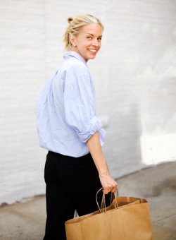
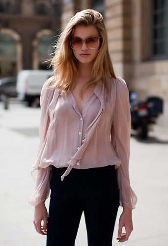
Billowy blouses. Pair them with cutoffs, skirts or skinny jeans to carry you through the summer.
sartorialsit via lots of spots, definitely golden, haute design
And in the winter they can be beautifully layered under blazers and boyfriend sweaters or paired with cropped pants, tights and ankle boots.
by tommy tom via jak&jil
Start scooping up a blouse or two now ladies. I know I will be!
sartorialsit via lots of spots, definitely golden, haute design
And in the winter they can be beautifully layered under blazers and boyfriend sweaters or paired with cropped pants, tights and ankle boots.
by tommy tom via jak&jil
Start scooping up a blouse or two now ladies. I know I will be!
Labels:
fashion,
i'm loving,
photography
OBSESSING...
With the prospect of a new apartment to decorate in the very near future, I've been returning to some of my major decor obsessions including glass chandeliers...
I doubt I'll have a dining space decent enough to warrant installing a light fixture, but I'm dreaming of one for the bedroom. The only question is... what hue? I adore the pop of the blue, but the glow of the amber is really speaking to me. Then again... there's always green! The hard part will be hunting one down that will fit within my budget, but this is one piece that will be worth the splurge for years to come.
*images via jessica helgerson, domino, elle decor, douglas friedman and unkown.
Labels:
interior design,
Lighting
MISS MILITARY
While I'm not one to hop on trends too quickly, I have to say that I've always been a big fan of military inspired style - perhaps it's my affinity for a good olive green? About a year ago I blogged about olive green as the new neutral paired with various shades of pink, pops of citron and silvery blues. Today? I'm loving these fresh combos as well...
Call me convinced that this will indeed be my summer-to-fall wardrobe staple! The trick is to pair this masculine piece with an overly feminine dress. I love the lacy white or cream as a strong contrast, and the watercolour + ruffles is completely unexpected! Here's how I'd do it...
My favorite color to pair with olive is a rich fuchsia, so the dress must have a bold shade of pink in it. This one from Forever21 is perfect with the brights against a grey and olive tone background. Gold hardware on the accessories is a must as it pops so well against that dusty green, but aviators would be almost too obvious of a choice - instead a neutral colored pair of wayfarers will match the casual attitude of the jacket.
*streetstyle via the sartorialist. jacket at anthropologie, wayfarers, dress at forever21, bag by marc jacobs at piper lime, sandals pour la victoire
Labels:
fashion,
fashion inspiration,
trends
Wedding Wednesday {Sugarcomb Event Design}
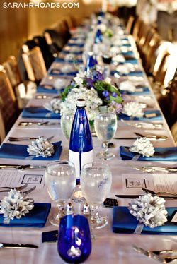
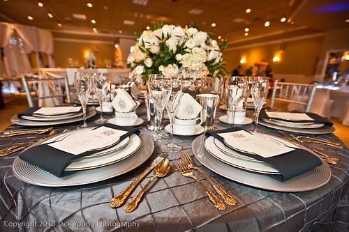
Wedding planning is a combination of skill and art. As any current or former bride will attest, you can never underestimate the importance of skilled wedding planning. Many brides will also discover that event planning in not in their genes. Nor in their mother's. Nor in their best friend's. For those brides, I highly recommend calling in a professional.
That's why I'm thrilled to welcome Sugarcomb Event Design as the feature sponsor of Apartment #34. This newly-wed can confirm - a wedding is really all about the details and if they're not your thing, that is where planning help from someone like Sugarcomb comes in!
photography by jack young and sarah rhoads
Based in Seattle, Sugarcomb helps brides with whatever they might need, whether that's narrowing down the vast universe of design choices, to managing all event planning and execution needs.
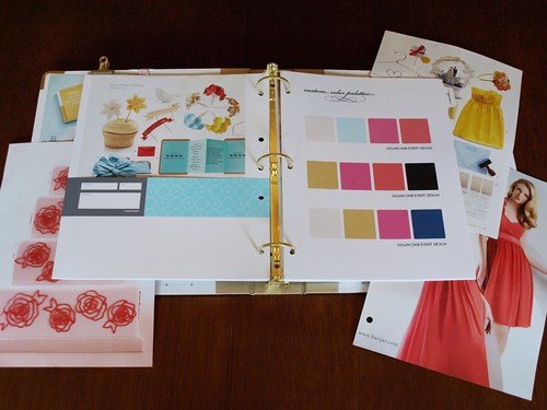
Sugarcomb also just launched a great starter kit they're calling The Sugared Starter (great name, right!), to kick off someone's wedding planning with guidance from an expert wedding coordinator and designer.
The package includes a customized wedding binder as well as logistical and design meetings to ease into wedding planning, and all of the decision making and questions that come along with it.
If you're newly engagd or know someone who is I'd highly recommend checking Sugarcomb out! A wonderfully planned wedding is sight to behold - and the key to a completely stress-free big day.
Would you like to reach thousands of style savvy readers everyday and let them know about your services, shop or art? Apartment #34 is offering a spnosorship special for August!
Email apt34blog {at} gmail {dot} com for more information!
Labels:
sponsorship,
wedding planning,
weddings
GLOBAL STYLE: TUNISIAN TURQUOISE
The brilliant turquoise blues adorning Mediterranean doors and rooftops have long been the quintessence of holiday postcards, but who knew all this beauty was inspired by function? Ancient civilizations actually believed turquoise could ward off bad luck and evil spirits, which is why the color is such a popular choice!
Dar Bibine, a hotel located on a Tunisian island in the Mediterranean, has embraced this historical color palette and updated it by combining archaic architecture with modern designers such as Panton, Gehry and Starck to create a completely fresh style. The clean white lines of traditional Tunisian buildings create the perfect backdrop for this updated design.
The evil-fighting properties of turquoise translate as well into clothing and jewelry, protecting people in the form of pendants, belts, and bracelets. You may be familiar with the blue “evil eye” prevalent in jewelry from Turkey and Greece which goes so far as to cause bad luck for whomever it is directed at!
Even if you're not totally convinced of its powers, there is no doubting this color's calming effect on the psyche, dissolving tension and promoting tranquility.
And as Pantone says of their Color of the Year 2010, "It's not just blue or green, it's both, which means it's calming and invigorating at the same time. And it makes you think of escaping to someplace tropical and beautiful" ... Say perhaps, Dar Bibine, Tunisia?
Labels:
blue,
fashion inspiration,
global style,
interior design,
turquoise
WOULD YOU, COULD YOU?
I think it's safe to say that most of us are a big fan of coral colored pops in our home... but what about entire walls?
...in lacquer no less!
It takes a brave client to trust their designer to take this color to the next level, but I think it's also easy to see how these two rooms make it work: lots of neutrals and using a tone on tone strategy to make the furniture blend more with the walls. Not to mention plenty of light!
As for me, I absolutely love the look of this color in all its high-gloss glory, but I think I'd be more likely to opt for something like this...
A little more calm but still with the desired effect.
Especially loving it paired with one of my favorite Missoni fabric for just the right amount of punch! What do you think? Could you do high gloss color in your home?
*room design by katie ridder, todd romano, carrier & co, m.design
Labels:
color,
coral,
interior design,
paint
Subscribe to:
Posts (Atom)