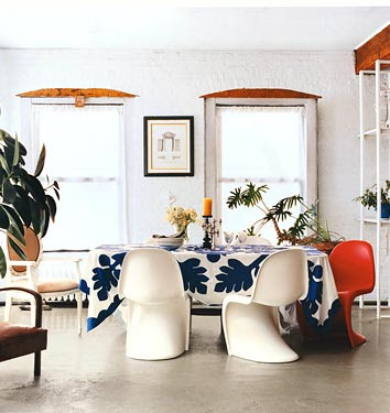
Fantasy Land

When you complete a project your mind immediately starts to spin considering all the possible next steps. So of course I'm going way overboard - setting my sights on the tiny closet-of-a-condo of my dreams! I know in the real world there is practicality and time constraints and budgets, but before I come back down to reality, let's have some fun shall we?

If I could replicate any room, I would choose...
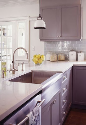


I think this stunning kitchen is a good place to start. It includes all my personal obsessions - subway tile, apron front sink, adorable pendant light and gray all over!


via coco+kelley

If we're talking dining rooms, which I don't currently have, but someday hope to, the combination of a banquet table of reclaimed wood and miss matched chairs give the place meant for sharing stories a story of its own.


via living etc

One of my renovation fantasies includes redoing my floors and I'm loving how the dark tones in this living room play off the crisp white walls. I don't know about the chandelier though...I think I've moved past that phase.


via living etc

Yet another space I don't have, but pine for - my very own work space. Again with the great little drop light and that typewriter! Much better than laptop on lap. In bed.


via desire to inspire

Speaking of bed, one should be pickiest about their bedroom. After all it is your sanctuary, your place of repose, or in my case where I dump piles of clothes. Maybe if my bedroom looked more like this I'd actually keep it that way (minus the animal skin rug).

Now if you could actually figure out how to get all these different looks to fit together you're way better at this than I!

Room of the Week 5.1

What do you say we start May off with something girly pink and urban cool all at the same time?


I fell in love with this image that I believe I found via sfgirlbybay months and months ago. I kept wanting to post it up here, even though the photo itself doesn't really capture the room - just a small portion of it. But there are so many great elements here... it's time to share.

My favorite part? The doors. If I moved out of this space, I'm pretty sure those suckers would be coming with me. They look like they have a hint of pink in them, but I'm not sure if that's the glass or the reflection of the painted brick - which is my second favorite element. Pink brick somehow seems like an oxymoron, which makes it a brave choice in my book, and I think it's just the perfect shade. (The couch, however, I'm not so sure about. Or that lamp.)

From what little we can see in the photo, the rest of the room (and the rest of the loft, I'm guessing!) has a great eclectic mix of found objects, worn in furniture, original art, and more. Victoria (or any of you dear readers) - if you remember this image and where it came from, I'd love to know because I'm sure the rest of this space is absolutely amazing!

I'll Have the Crab...

Um... are you serious?

When I received my weekly email from 1stDibs this morning, I almost died at the sight of this table. For $3200. I guess if you were going for a statement piece in a seaside vacation home... maybe. MAYBE. For like $100. It looks like discarded junk from a fisherman's wharf themed restaurant! But that's just my humble opinion.

Personally, if I'm going to spend $3200 on crab, I'm going to go with this bracelet from designer Antonio Palladino at Barneys.


Oh, excuse-moi. It's actually $3995. But I think it does make a better statement. Something to pass on to the grandchildren perhaps?

I think I'm going to stick with crab cakes for now, thanks. Yum.


Romantic Pre Wedding Photo

Romantic Pre Wedding Photo
Diana and pictorial Hendrick in coast periphery. It is really romantic view. They are love couple that is loving each other, respects, requires and always loves. Hopefully love they getting bless from God.

Pre Wedding Photo in Invitation Card

Pre Wedding Photo in Invitation Card
Photos is attached having align to greet the coming invitation guests. The photo tells a story about meeting journey story of Dave with Alice. This marriage is multiplying is second for they. Hopefully happy forever like hope Dave and Alice.

Sweet and Handsome in Happy Pose

Sweet and Handsome in Happy Pose
Handsome and beautiful face by smiling is happy decorates their marriage invitation card. Invitation will be alloted two weeks again. Hilarious party will be performed a luxuriant building.

Smiley and Happy Pose

Smiley and Happy Pose
Candidate couple of nuptials laughs happy. Photo is taken when Lucie and Andy is swimming. Both swim teacher a school. They are drawing up marriage invitation card which will be decorated by their photo.

Pre Wedding Photo 1

Pre Wedding Photo 1
David and Anne poses for used to decorates their marriage invitation card. Both had drawn up party since two months then. Compatible couple, cute with looker young man.

Musical Chairs

As a lover of dining rooms in general (ie, I'm Italian and we eat a LOT of food), this corner of the home has always meant a lot to me. Never being one to purchase a whole set of anything, I naturally gravitate towards the mix and match aesthetic of quirky little chairs paired with a simple table...


LOVE the rustic table with chairs to match. And I like that they set one side of the table with one style, and left the garden chairs on the other. A nice take on the mix and match theme. This is definitely my style. Via PointClickHome.


A very eclectic mix of chairs at this table, it's a great way to highlight famous designs from years past.

A more recent take on this trend is painting all the chairs one color to create a certain uniformity amongst the different styles. I really love this idea - especially when it's done in a way that really highlights the shape of each chair. In this case, I think the more different the better!


A perfect example from Elle Decor. The black against all the light wood and white table and walls truly shows of the individual pieces, while still creating continuity.

Another thought? Two accent chairs at each end of the table that are the most unexpected choices - like this...


I think this works for two reasons - the height of the chairs are the same, and the style of the surroundings is simple enough to support a unique choice for the end chairs.

Another take on this theme...


This works for the same reason - the white brings it all together and the height is the same, while the style of the room remains fairly simplistic.

Now for my new favorite twist on this whole mix and match chair theme...


The single, solitary, statement chair. It's hot. No really - HOT. I love how the red pops in this room. It really gives it a little personality and adds to the saturated colors. (Via Domino.)


A more subtle take on this style, the Kartell Ghost Chair almost disappears in this room. And how much do you love the furry (and totally impractical) fabric for the other three white chairs? While I prefer a warmer style for my own table, this one is very modern chic.

As for me - I have two chairs at my table that I love... and I'm on the hunt for four more to mix it up with! I think I have a weekend project on my hands...


A Blank Slate

Ok, here it is, the moment we've all been waiting for. I'd prefer to have had the time to get everything nicely styled or even cleaned up from the construction, but I just can't wait.

So Ta-Dah!! I present to you my freshly painted apartment (please excuse the amateur photography and less than stellar lighting)!


Welcome to my newly neutral living room!


I went with Benjamin Moore Moonlight White on the walls and BM Simply White for the trim. And all low-VOC! As you may have noticed, something else is missing. My other big decision was to remove the picture rail. It's an amazing thing to realize that rather than agonize over a difficult design element, you can just remove it.


For a little fun, I highlighted the room's archway and molding by painting the faux columns BM Thundercloud Gray. My green Replay Sofa from EQ3 ties in nicely with my original fashion inspiration for the room. The lamp, though probably not in its permanent location, has little flowers on the shade that nearly match the gray paint. A complete unintentional coincidence.

The archway separates my "entry" from the rest of the living room. The door on the right is my "entry" closet. There are gorgeous glass knobs on all of the doors that fit with the time period of 1904 building.

Though it may look plain, remember my design inspiration. I love me some clean, danish mod lines. The room also feels like it has doubled in size.


What in this picture doesn't fit??

I know I could probably get away with the pink radiator, but please understand that after living with the color for two years, the goal is to create something like this.

So there you have it. My blank slate. It may seem a bit generic to some, but remember, a 475 sq ft space is not going to be my long term home. The goal is make something that is both gorgeous and universally appealing.

Now the possibilities for my next steps (bathroom? bedroom?, kitchen, oh my!) seem endless. This is only the beginning folks.

Beauty is Pain

Gorgeous mirror. But how on earth do you hang it without poking an eye out?


The porcupine mirror from Horchow is truly stunning with the way the quills fade from black to white in a beautiful inconsistent pattern. I have no idea how I'd get it on the wall without a few minor cuts... but it could just be worth it. :)


We Interrupt This Broadcast

Due to a litany of technical difficulties I'm not able to bring you the grand reveal of my newly painted condo today as promised. But take my word, its fabulous! And I swear, I will share all very soon.

In the meantime, visitors to Apartment#34 have kindly taken time to say hi, send suggestions, and generally say really nice things about my renovation adventure. I want to thank everyone - commenters and lurkers alike for taking the time to stop by. THANK YOU! I now understand why this whole blogging thing is so addicting. It feels amazingly good to get a note of encouragement from total strangers!

I thought I'd take a moment to respond to everyone and let you know what you have to look forward to.

  • I have my heart set on painting my radiator, but it requires sand blasting and heat resistant paint. But fear not - a solution is in the works. Stay tuned on that one.

  • Carrie and Carol- I think great minds must think alike because I am in love with grey right now. You'll soon see.


  • As for my fashion based inspiration, the fall shows are always the biggest influence on my aesthetic - I think its living in Seattle that makes me a lover of layers.

Here's an attempt at fashion to room translation. I look at this gorgeous outfit from Day Birger et Mikkelsen


and translate the color palette, the great use of pattern, and the fab mix of matte and luxe fabrics in this room by David Lawrence


(via Habitually Chic)

You'll have to determine if I pulled off anything remotely as successful once my place is ready for its Ta-Dah moment.

I have to share another source of inspiration I found this weekend. My amazing man surprised with a stay at Hotel deLuxe in Portland. On the outskirts of the Pearl District, this tdf hotel is perfect for a weekend getaway.


If this doesn't make you drool then I don't know what will!

As for what's next, I'm going credenza crazy, looking for lighting, dreaming of new bedding and trying to determine what project to tackle next.

We hope to return to our regularly scheduled programming tomorrow!

Smiles Is Happy Before Party

Smiles Is Happy Before Party
Couple from Thailand, they are very happy nearing party. Beautiful photo is attached in invitation card wedding green color.

Susan and Andre in Pre Wedding Photo

Susan and Andre in Pre Wedding Photo
Susan and Andre. They pose for with beam face because happy. Picture attached for invitation. They get married next month.

Pre Wedding Photo, Oh So Sweet

Pre Wedding Photo, Oh So Sweet
Natasha smiles shame. She gets beautiful flower from Harvey. Picture taken for pre wedding photo which will be printed invitation their nuptials.

Glossy Finds: Aptware for the Table

It usually takes me weeks before I get to the latest issue of my Domino, but with the ridiculously hot weather this weekend, I took the opportunity to catch up on my reading by the pool, and this piece really caught my eye...


I had never heard of Aptware before, and now am completely in love with the swirl of pattern that coats these pieces created by master artisans in France.


Aptware originated in a small village at the foothills of the Luberon in France around the mid-l8th century. They say the colors of the pieces were naturally inspired by the soils of the region - a variety of yellow, red, green, brown and white pigments which create the glaze for these pieces.


Some pieces are more vibrant in color than others. I love the brightness of these options from the Atelier du Vieil Apt, which is the creator of the pieces featured in Domino.


While I don't know that I'd want a whole table filled with these pieces - mixing them up with some clean white pieces would make for a different and lovely tabletop... don't you think?


Swooning for Studio Ilse's Neutral Metallics

I've always been drawn to soothing neutrals, but my latest obsession is the combination of greys and taupes mixed with high gloss metallics, so when I stumbled across these photos of this gorgeous restaurant in the Grand Hotel in Stockholm, designed by StudioIlse, I had to share...


I think we all know by know about my obsession with gold and this pendant lamp is no exception. The hardware is also the perfect accent to that warm taupe paint, along with my favorite kitchen material - marble!

Again, loving the gold used to create a splash of glam on what would otherwise be a very basic light fixture. And the fabric on the couch? Let's just say I happened to order mine in the same color. The pop of yellow from the chair is perfect.


Even their tabletops combine the best of these textures. Did you notice that placemats are marble? And, I love the organic linen runner and what looks to me to be horn handled cutlery for some added texture.


Just in case you're feeling even more swanky, this is their bar area. That screen is AMAZING.


Friday Flowers

Ranunculus are one of my favorite flowers for their layers and layers of soft ruffled petals, so when I spotted some at my local Trader Joes I had to indulge!


I set them up in my kitchen, right next to this vintage still life painting in a gorgeously worn wood frame that I picked up a few weeks ago. I love them together!

Have a beautiful weekend friends! And be sure to pick up some fresh flowers - they'll make you smile every time you walk into the room.

Office Space

I don't know how you prolific bloggers do it - juggle job, second job, boyfriends, girlfriends, errands, cleaning, email, Thursday night TV, working out, laundry day, getting away for the weekend, and consistent blogging! I hope to get the hang of it soon.

Until then, I will be at my 9-5, suffering from desk lust for a work space like this.
via black eiffel
Happy weekend ya'll. See you Monday!

The Saga Continues

My dearest love Cassandra over at coco+kelley had her bff radar on overdrive because she posted about my radiator situation the same day I did, without the two of us even discussing it. And of course, being the style maven that she is, she had some brilliant suggestions, which in turn got me thinking about more options....so I present them to you.

Here are additional pictures of my radiator in my livingroom. It sits at the back left corner of the room next to my bedroom door and next to the one large window. With all the natural light the corner has functioned as a reading nook up to this point (though changes might be afoot...) But back to the radiator issue.


If you've been following along, the livingroom began covered in pink wallpaper, perfectly color matched to my still pink radiator. The wallpaper is now a thing of the past, and while I'm desperate to have the radiator painted to coordinate with my new color scheme, until I come up with a less expensive way to get it done, I may have to resort to other solutions.

Cassandra brought up the idea of covering the radiator with a shelf which intrigued me. I have zero office space and perhaps I could create something a laptop could fit on. When I found this pic of Carrie's Sex In the City apartment, I knew I must be on the right track. I heart that show - can't wait for movie!


via Apartment Therapy

I have now learned there is also the option of simply covering the radiator up with custom radiator cabinets like this one. Eh?


via the radiator cabinet shop


Or I could go the route of making the radiator a focal point of the room by painting a pattern on it like they did in NYC and featured on AT. Not being the DIY queen, I have a feeling it wouldn't turn out so well for me though.


via apartment therapy

But then I come back around to how beautiful a well painted radiator can be. Check out this home featured on D*S. Maybe the investment would be worth it.


via designsponge

What to do, what to do? Only time, and the trajectory of my income, will tell.